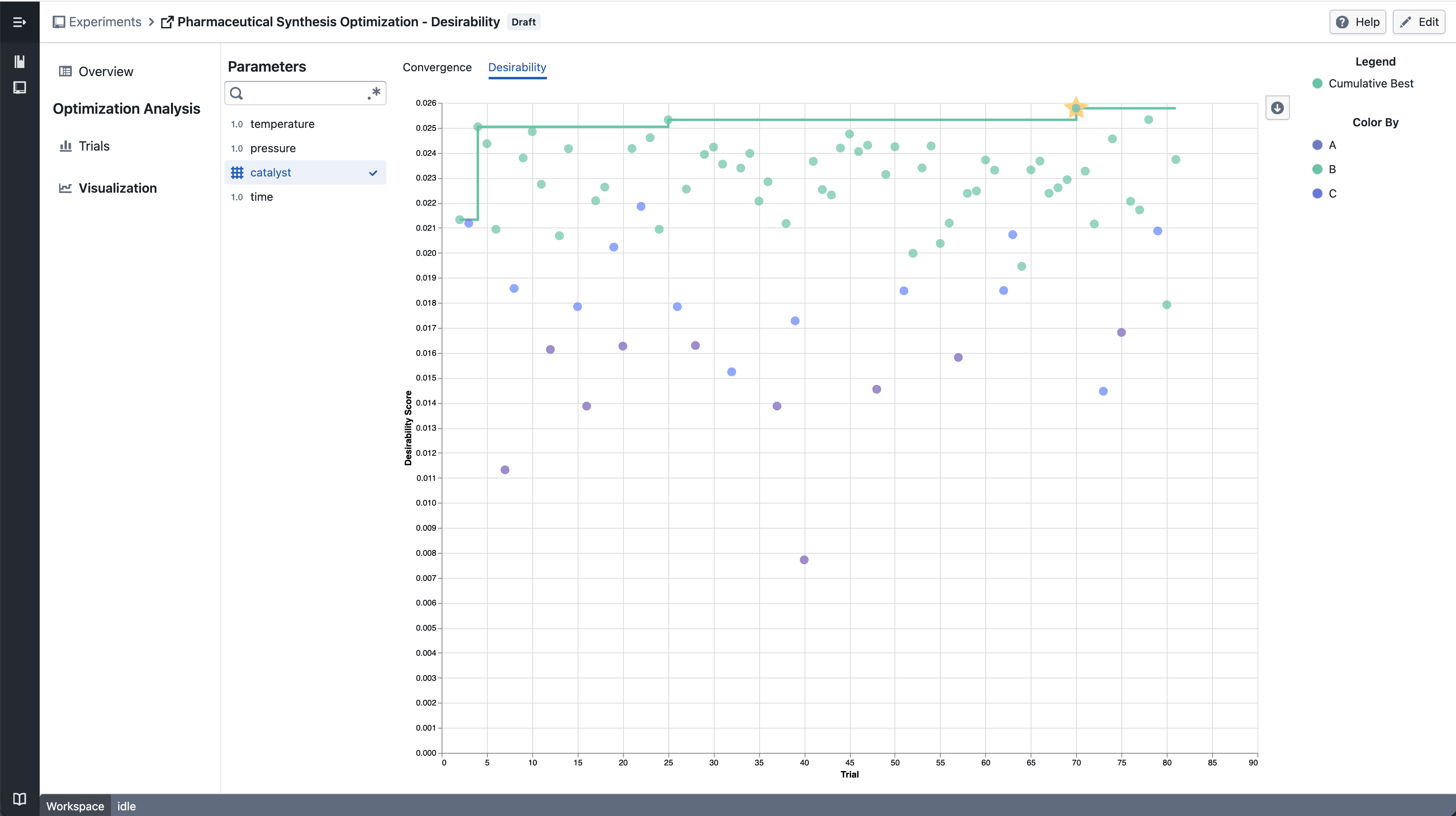
Desirability Convergence Chart

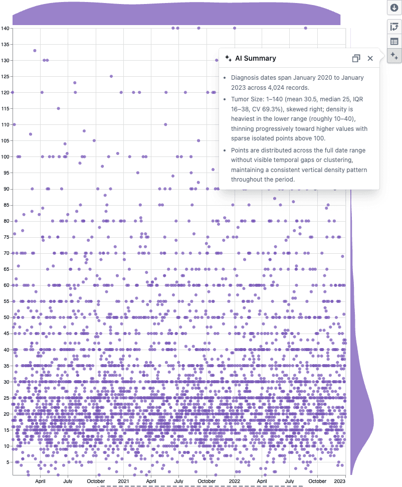
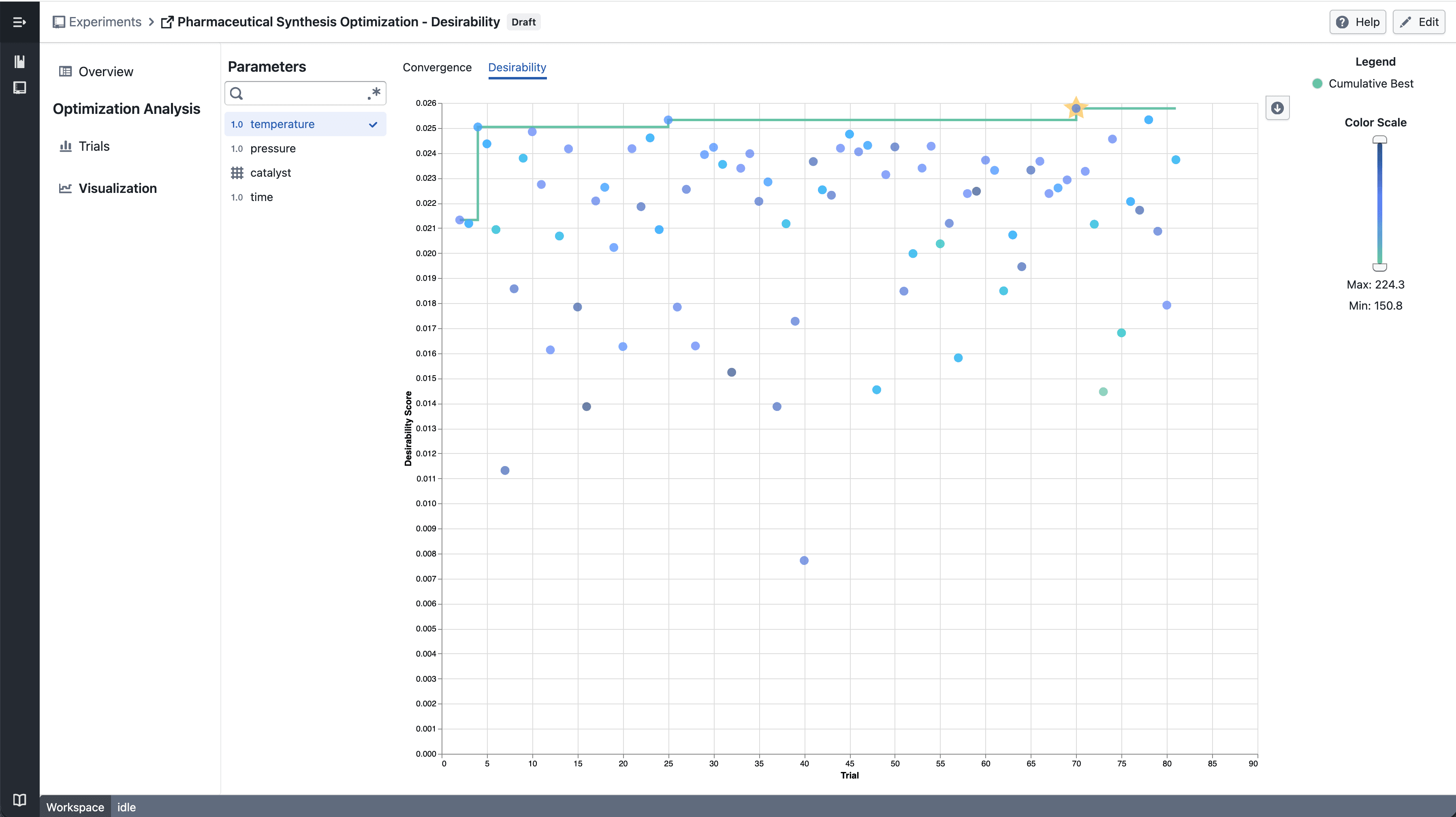
New desirability convergence chart for tracking optimization progress across experiment trials.

What's included

How it works

Numerical Parameter - select parameter

  • Select a numerical parameter from the parameter sidebar to color data points by that parameter's value
  • A continuous color scale shows how parameter values relate to desirability scores across trials
  • The best so far line tracks the highest desirability achieved up to each trial

Categorical Parameter - select parameter

  • Select a categorical parameter to color data points by category
  • A discrete color legend identifies each category value

Notes

  • The convergence chart is available under the Desirability tab in the Visualization section
  • Chart interactions and layout may continue to evolve during the beta phase
  • If you notice any unexpected behavior, please share steps to reproduce
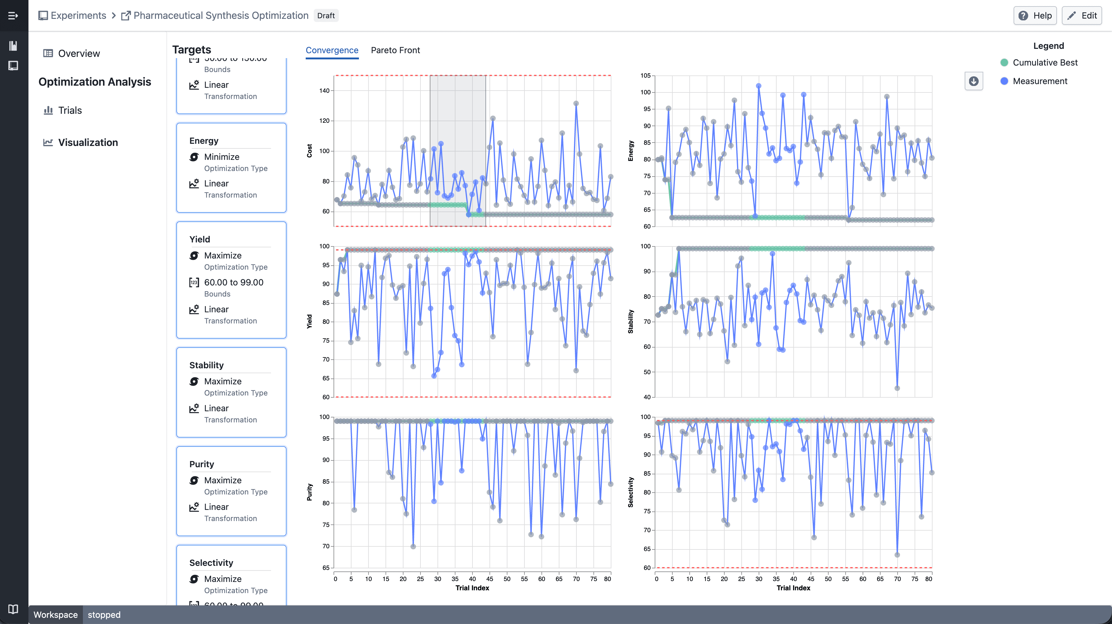
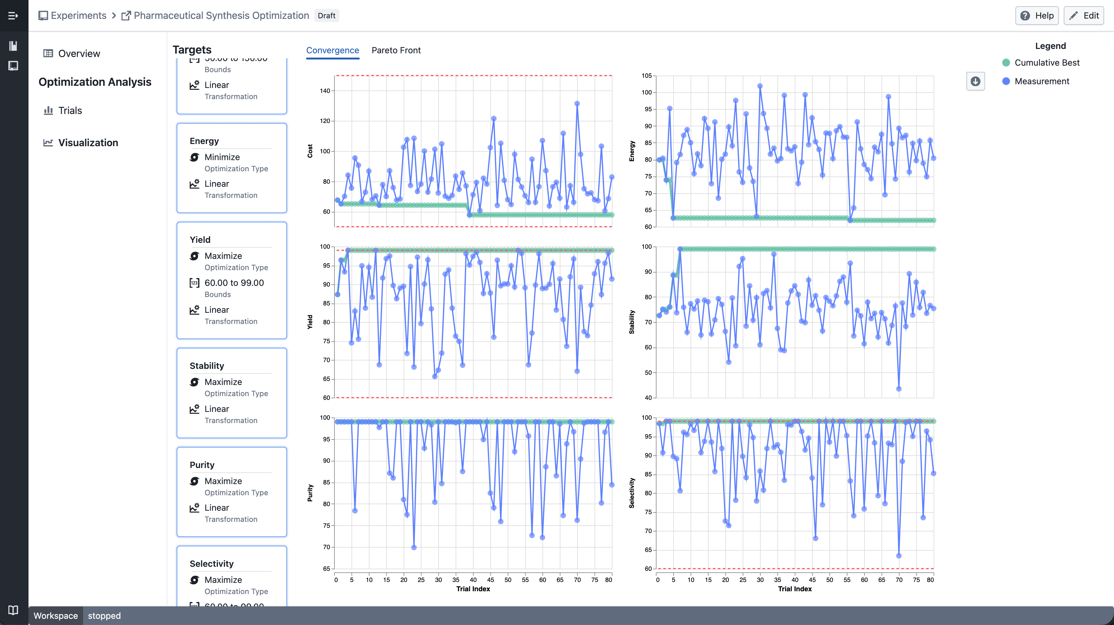
Trellis plots in Experiment Visualization Convergence

Split convergence plot into a multi-panel grid when multiple targets are selected.

What's included

How it works

Trellis convergence plot

  • Select multiple targets from the target sidebar
  • The convergence plot automatically splits into a grid — one panel per target
  • Each panel shares the same x-axis (iteration index) but has an independent y-axis scale

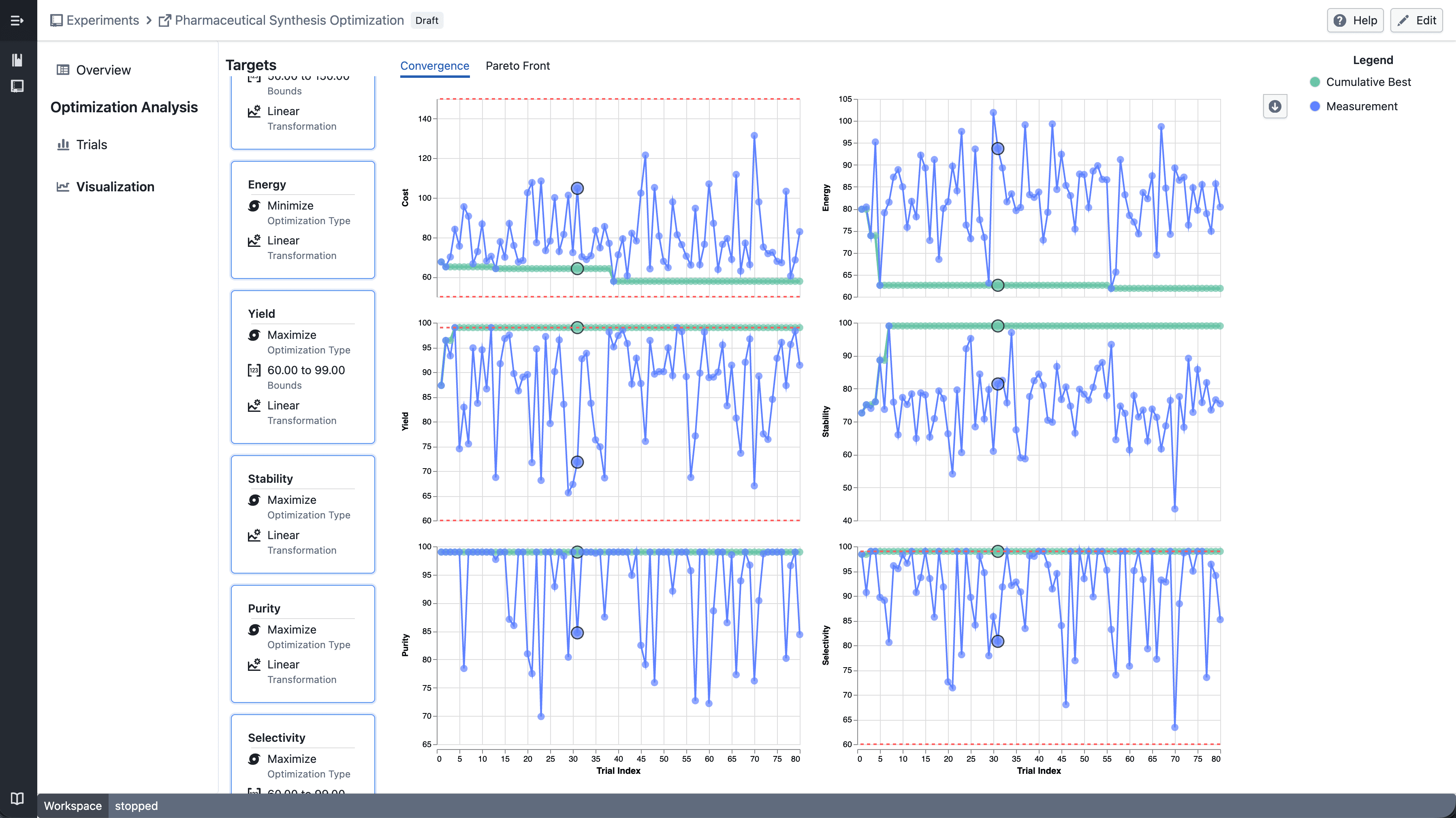
Trellis - select point

  • Click a data point to highlight the corresponding trial across all panels

Trellis - draw point

  • Shift-drag to draw a brush selection across panels
  • Points outside the selection are dimmed
  • Up to 6 targets can be displayed at a time

Notes

  • Single target selection continues to show the standard convergence plot
  • Trellis layout and interactions may continue to evolve during the beta phase
  • If you notice any unexpected behavior, please share steps to reproduce
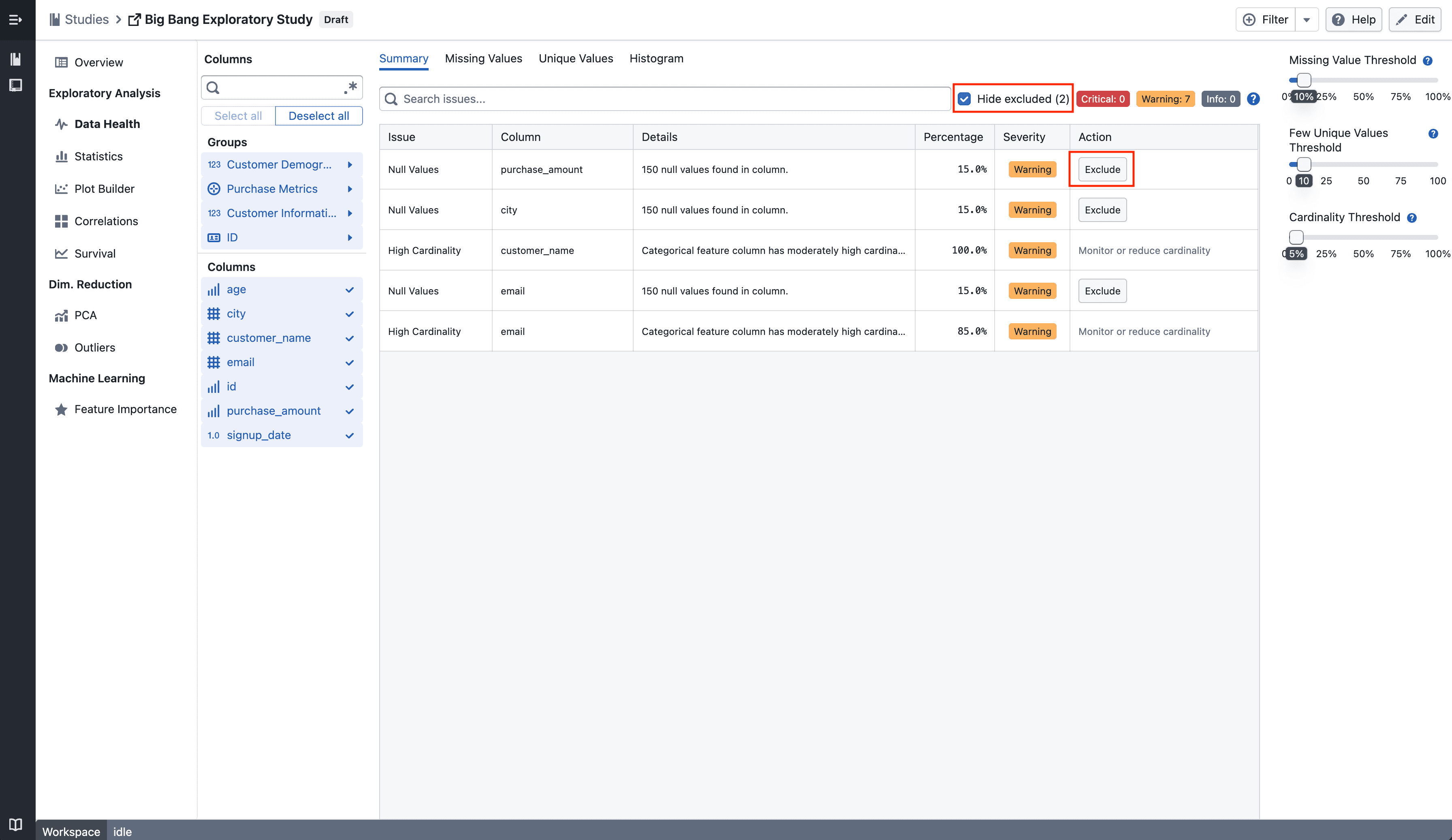
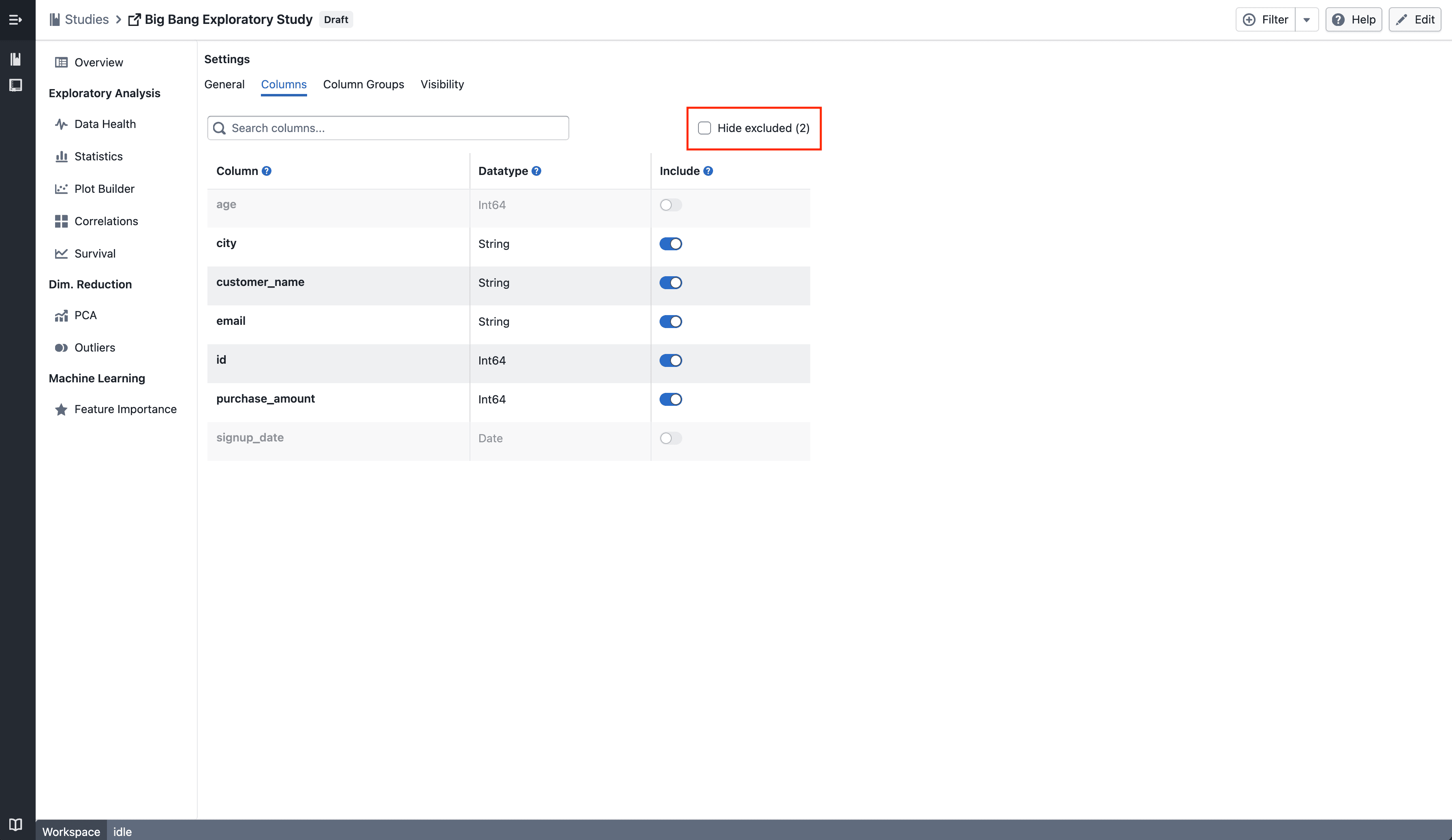
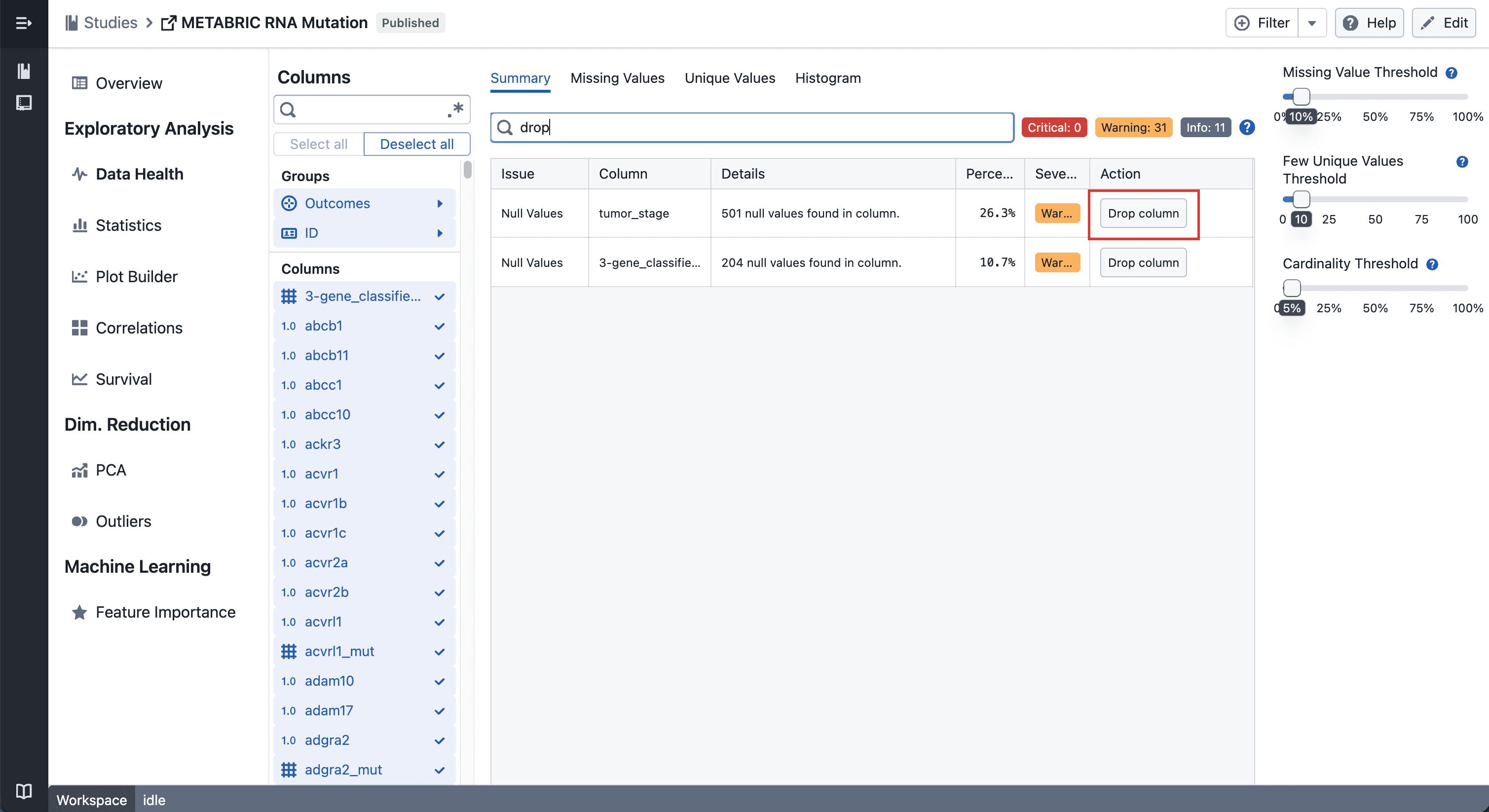
Drop Column in Data Health

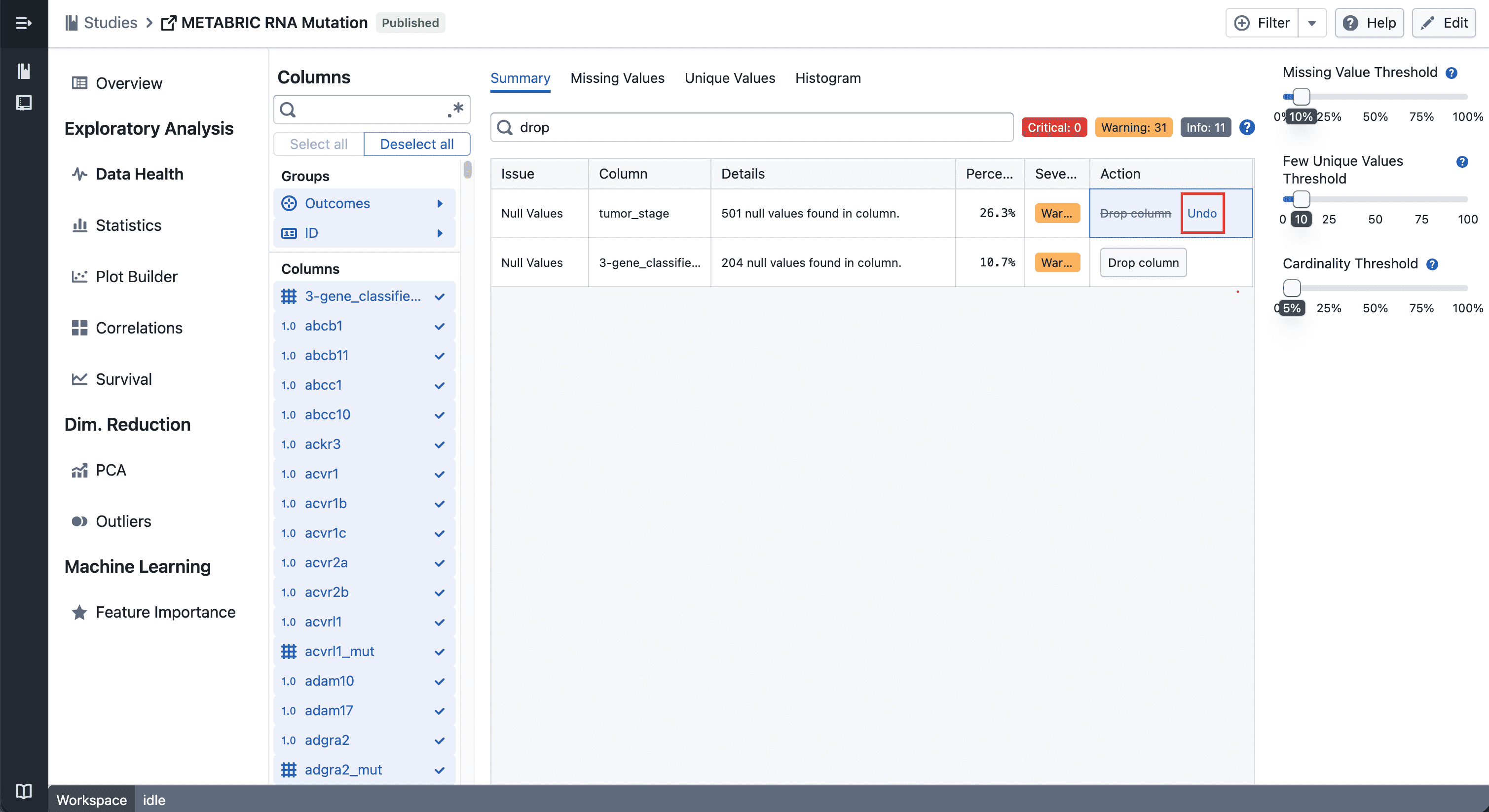
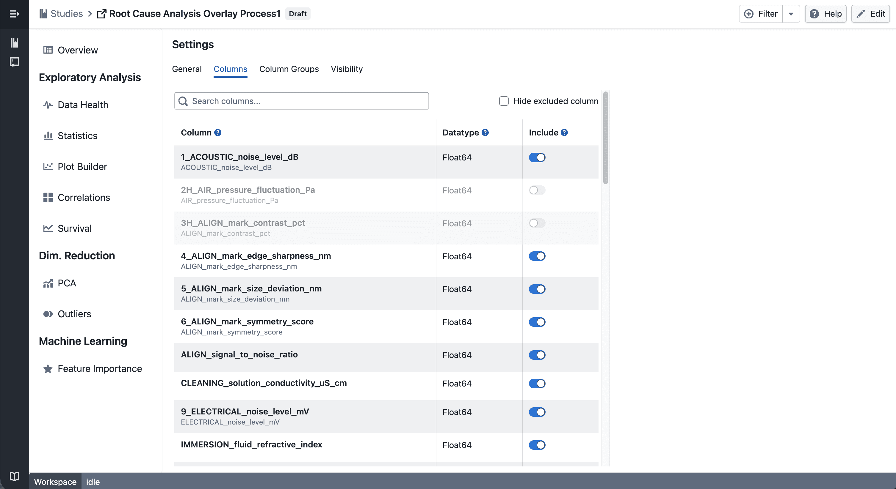
You can now drop columns directly from the Data Health table. Dropped columns are hidden across all study views and the change is saved automatically.

What's included

Drop Column

Drop Column Button

Click the drop button on any row in the Data Health table to hide that column across all views in the study — plots, statistics, and column groups included.

Undo

Undo Drop Column Button

Changed your mind? Hit the undo button on the same row to bring the column back instantly.


Notes

  • Dropped columns are hidden, not deleted — your data stays intact
  • If you notice any unexpected behavior, please share steps to reproduce
Multi-Evaluation Navigation in Feature Importance

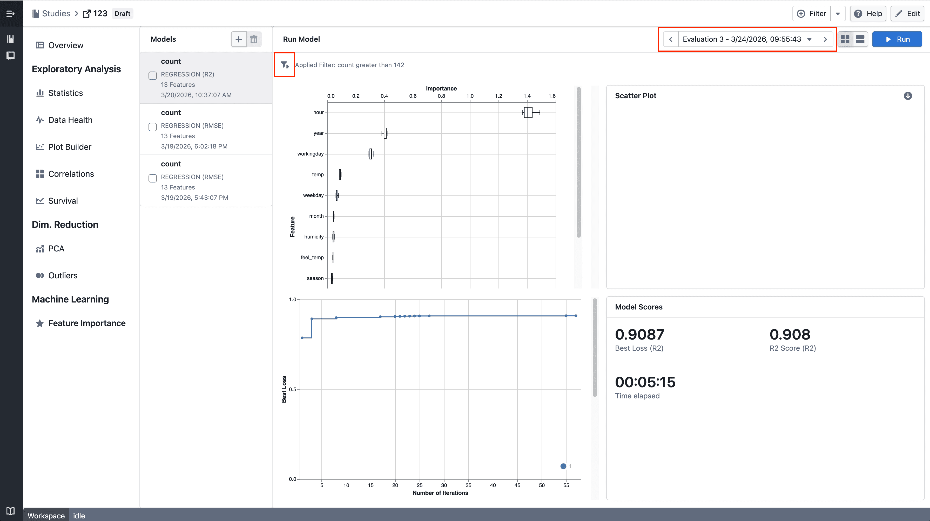
Navigate between historical model evaluations in Feature Importance.

What's included

How it works

Feature Importance

  • Step through historical model evaluations using the new navigation controls
  • The latest evaluation remains the default when no selection is made
  • Quickly reapply filters across views for consistent analysis

Notes

  • If you notice any unexpected behavior, please share steps to reproduce
Trellis plots in Plot Builder

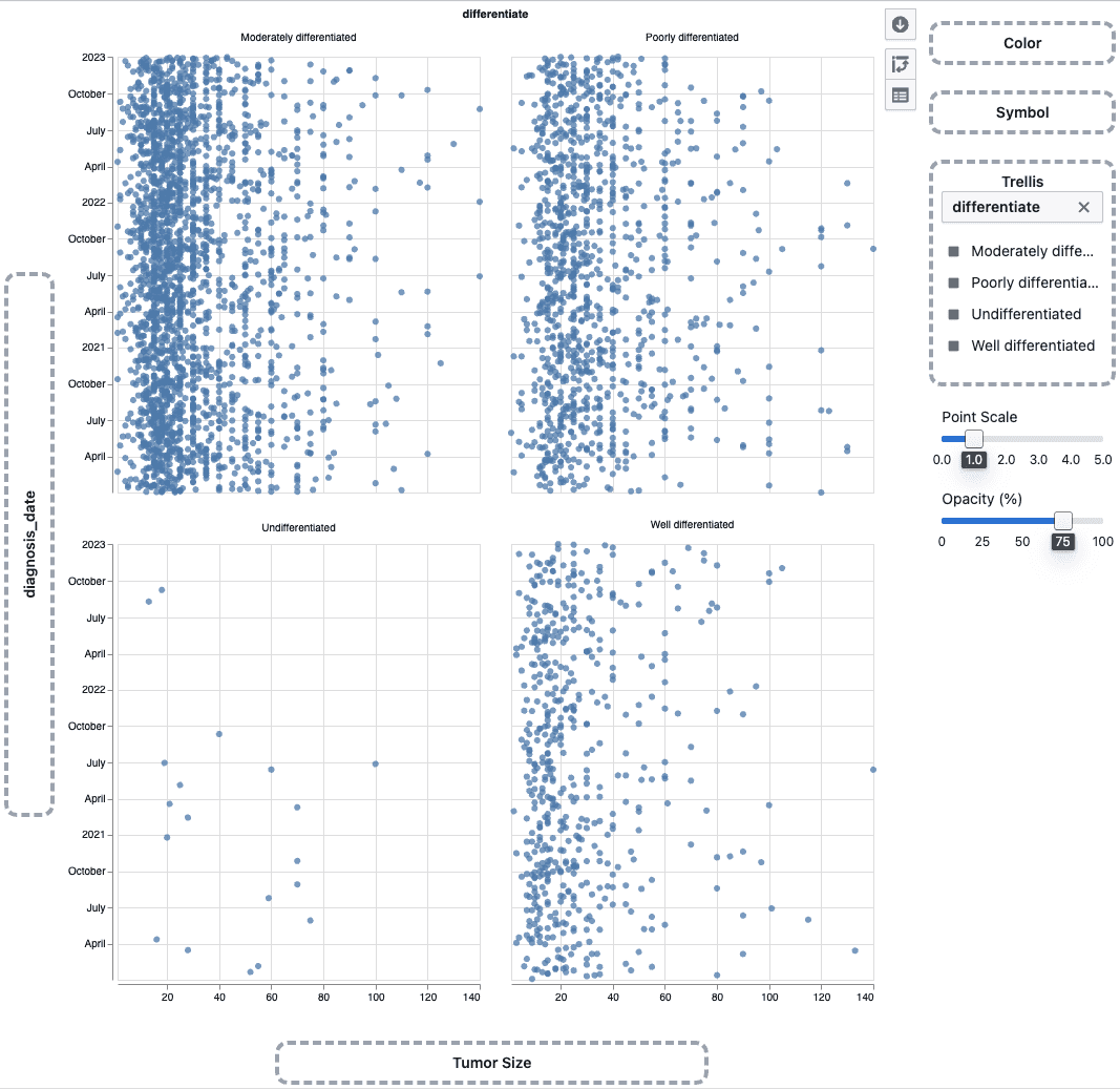
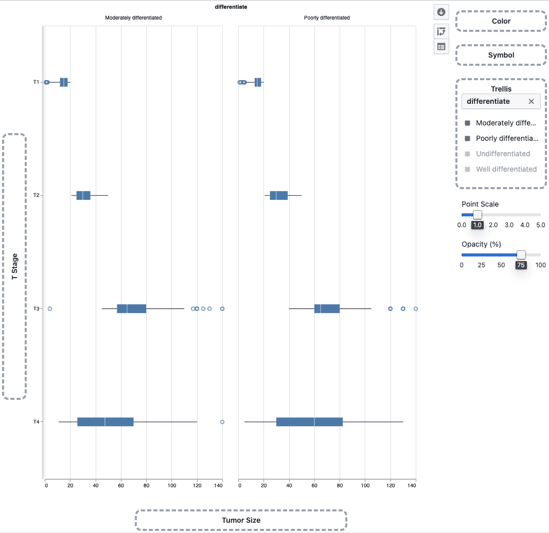
Split scatter plots and box plots into a multi-panel grid by any categorical column to compare patterns across groups side by side.

What's included

How it works

Trellis scatter plot

  • Drag a categorical column onto the Trellis drop zone in the plot sidebar
  • The plot splits into a grid of panels — one per category
  • Works with scatter plots and box plots

Trellis box plot

  • Use the trellis legend to choose which categories to display
  • Up to 4 panels can be shown at a time

Notes

  • Heatmaps do not support trellis
  • Trellis behavior may continue to evolve during the beta phase
  • If you notice any unexpected behavior, please share steps to reproduce
Save option for global filters

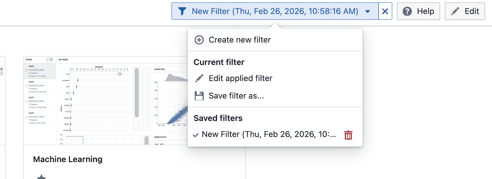
Studies now supports saving global filters, allowing you to reuse frequently used filter conditions across sessions.

What’s included

Global filters with save option in Studies

On click

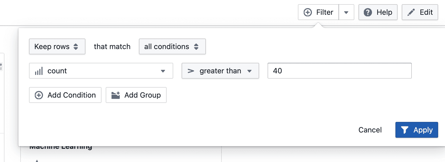
  • Click Filters to access global filtering actions
  • Create new filter conditions using supported operators and values

On create On save as On save as dialog

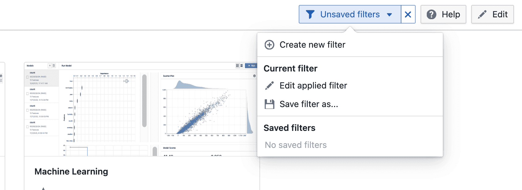
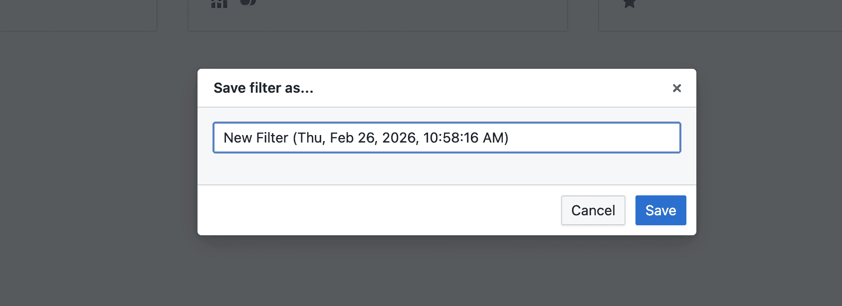
  • New filters can be saved for reuse by providing a filter name

On apply

  • Applied filters can be edited and updated if they were previously saved
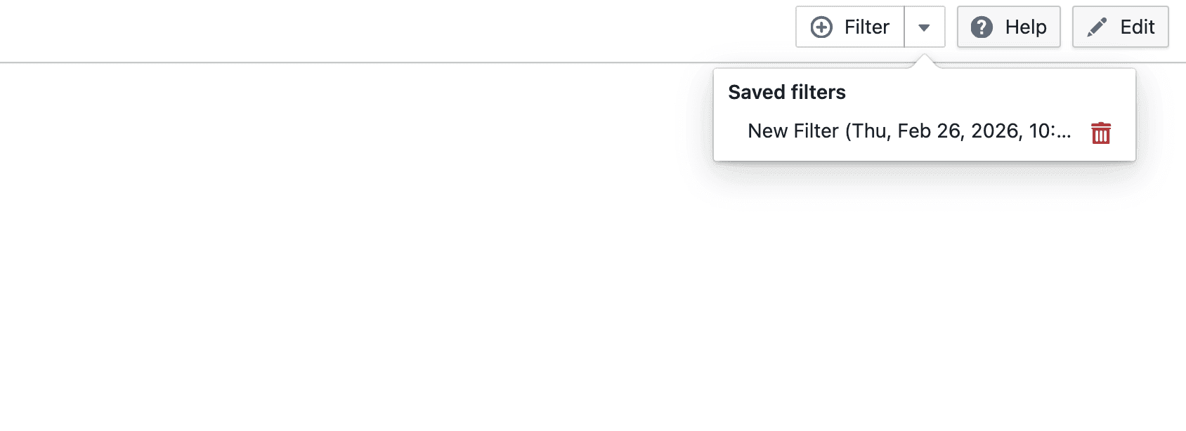
  • View and apply saved filters from the Filters menu
  • Saved filters can be reused, updated, or removed

Notes

  • Global filters apply to the current study
  • Saved filters are available across sessions
  • Filtering behavior may continue to evolve during the beta phase
  • If you notice any unexpected behavior, please share the steps to reproduce it

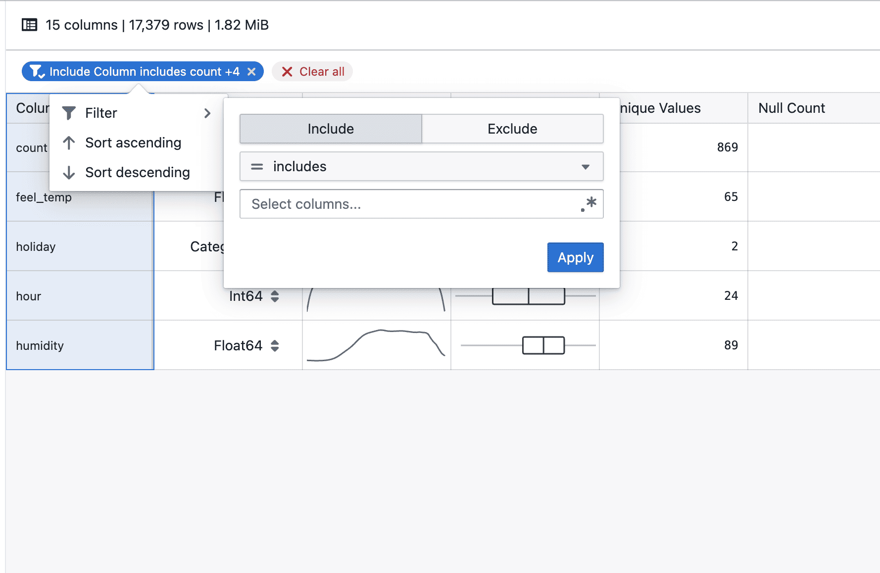
Add filters to statistic table

Statistics tables now support column filtering to make it easier to narrow down and analyze values.

What’s included

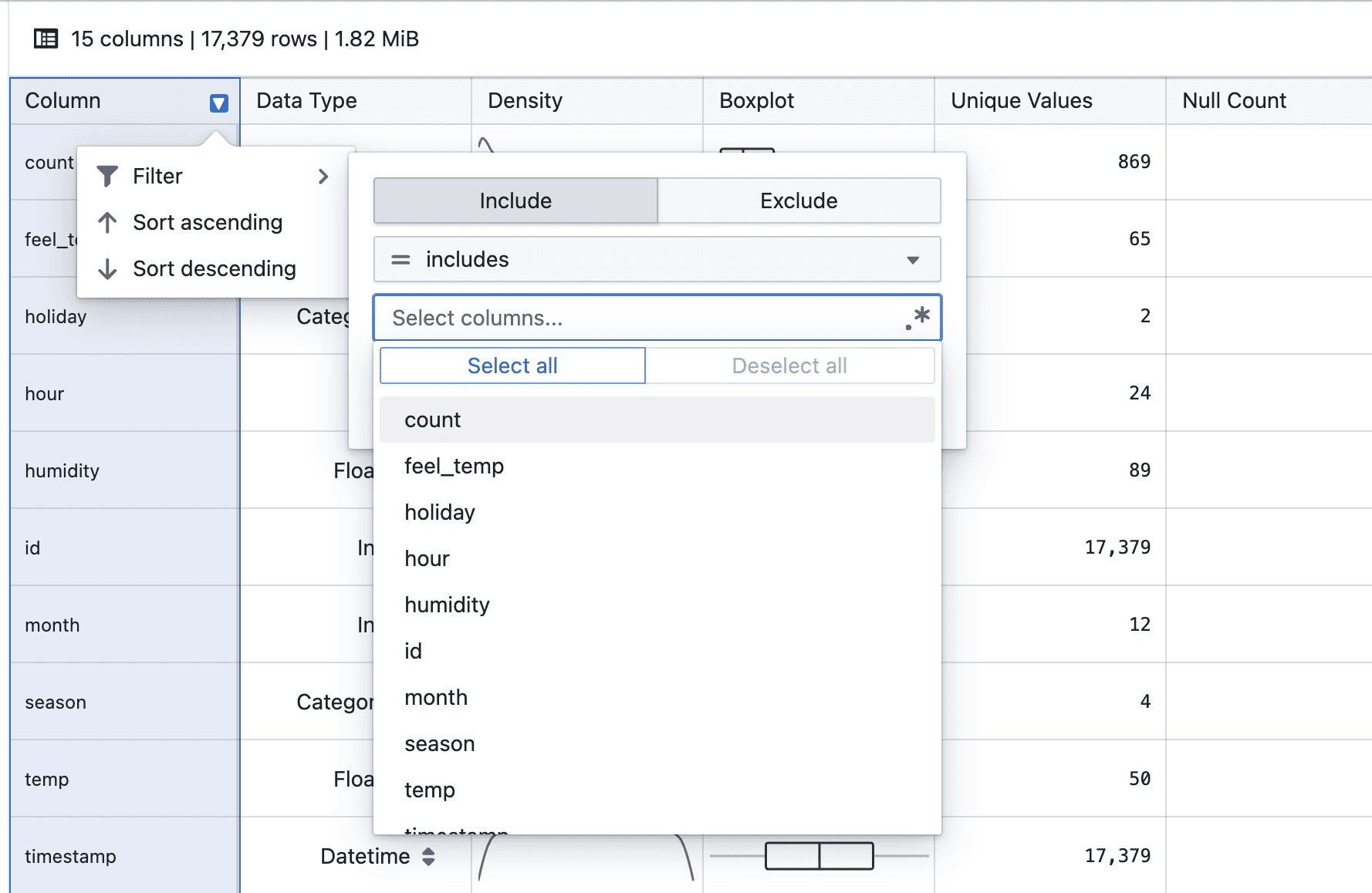
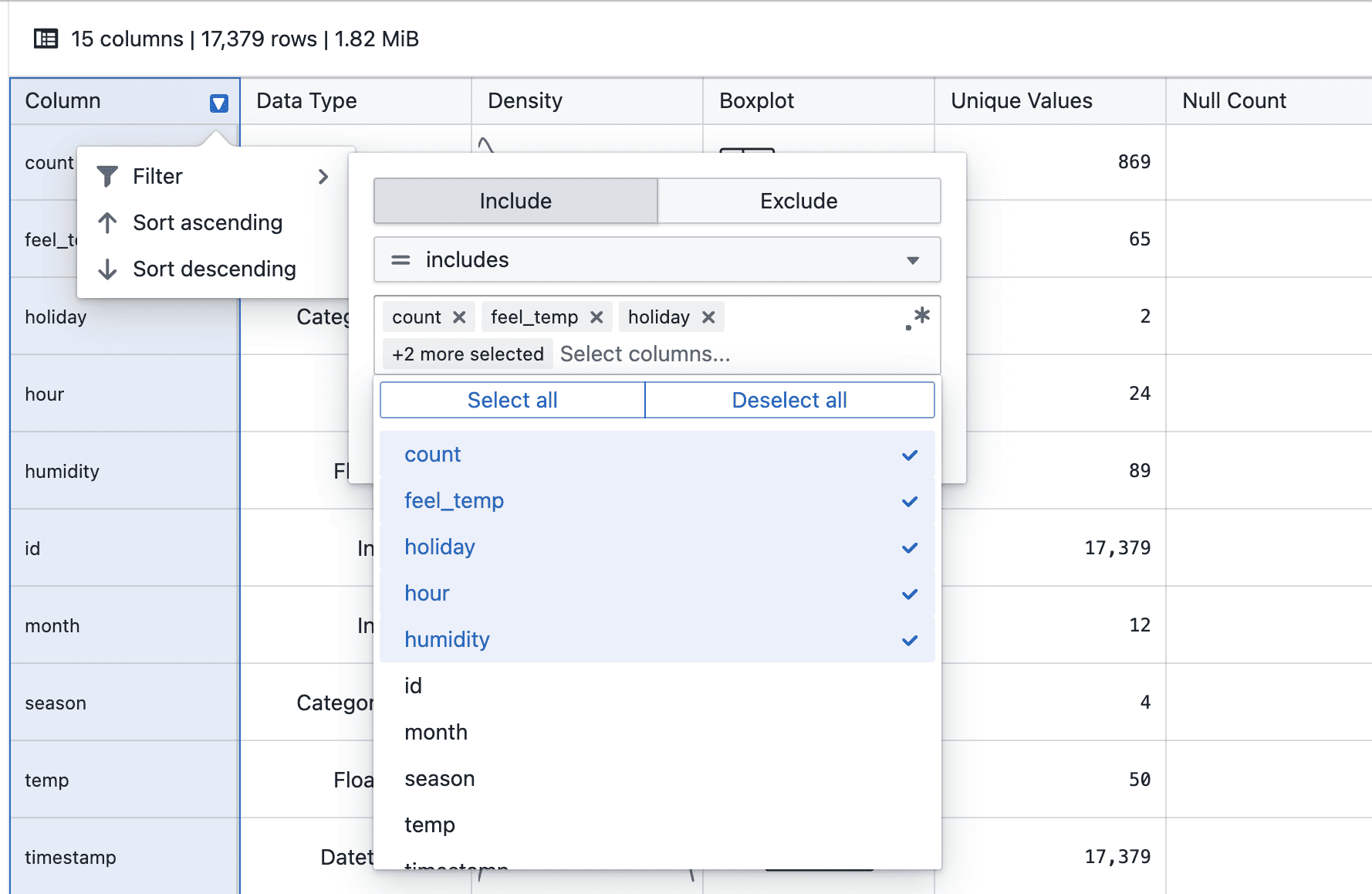
Column filtering in statistics tables

On hover

  • Hover over a column header to click on filter to access the filter menu

On applying

  • Select a filter operator and provide a value (where applicable)
  • Click Apply to add the filter condition

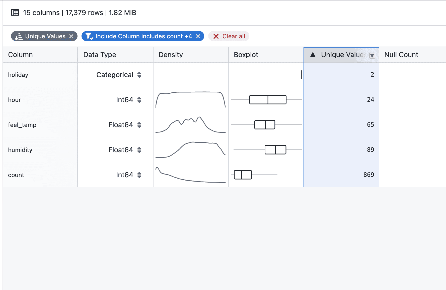
After applying

  • Applied filters appear as tags below the table header
  • Multiple filters can be added to progressively narrow down results
  • Individual filters can be removed directly from their tags

With sorting

  • Filtering and sorting can be used together to refine and order the displayed statistics

Notes

  • Filters apply to the currently displayed statistics
  • Multiple filters are combined to further narrow down results
  • Sorting respects the filtered result set
  • Filtering and sorting behavior may continue to evolve during the beta phase
  • If you notice any unexpected behavior, please share steps to reproduce
Add sorting to statistic table

Statistics tables now support column sorting to make it easier to compare and analyze values.

What’s included

Column sorting in statistics tables

On hover

  • Hover over a column header to reveal the arrow-down icon

On click

  • Click the arrow-down icon to choose ascending or descending order

Sorted

  • Once selected, the active sort order is clearly indicated, and a tag appears at the top right

On clear

  • You can change the sort direction or clear the sort by clicking the column header again, or remove it directly from the tag

Notes

  • Sorting currently applies to the displayed statistics only
  • Additional enhancements, such as combining sorting with filters, will be added in future iterations
  • If you notice any unexpected sorting behavior, please share steps to reproduce
Release notes popup

Release notes now automatically pop up the first time a new update is available.

What’s included

Auto-open when there’s a new release

  • Release notes will open automatically when there’s a newer release than what you last acknowledged
  • If you’ve already seen the latest release, it won’t pop up again
  • You can still open release notes anytime from Support → Release notes

Notes

  • This is an early version and we’ll refine the trigger rules over time
  • If you spot incorrect popup behavior (e.g. repeated prompts), please share:
    • steps to reproduce
Kaplan-Meier survival analysis

Analyze survival data with Kaplan-Meier curves, supporting event tracking, censored observations, group comparisons, and interactive visualizations.

What's included

Survival curve visualization

Kaplan-Meier survival curves

  • Step function curves show survival probability over time
  • Tick marks indicate subjects who left the study without experiencing the event
  • Filter by time period to focus on specific study phases
  • Hover over curves to see detailed statistics at each time point

Group comparisons

Group comparison

  • Compare survival across multiple groups with color-coded curves
  • Use filters to define groups
  • Legend and tooltips identify each group

Event and censoring logic

  • Set event conditions for what you're tracking (e.g., death, disease progression)
  • Set censoring conditions for subjects who exit the study early
  • Use flexible filters to define complex criteria
  • Data not matching either condition is excluded

Multi-panel plots

Faceted survival plots

  • View multiple survival curves side-by-side in a grid
  • Split data by categories for easier comparison

Interactive tooltips

Hover over any point to see:

  • Time value and date
  • Survival probability
  • Subjects at risk
  • Events occurred
  • Subjects censored
  • Group name (when comparing groups)

Notes

  • New beta feature - behavior may change based on feedback
  • Large datasets are limited to 5000 data points for performance