6 posts tagged with "Experiments"

View All Tags

Convergence plots organized by observation order

Follow optimization progress more clearly with completed results ordered as observations and predictions grouped separately.

What's included

A clearer optimization sequence
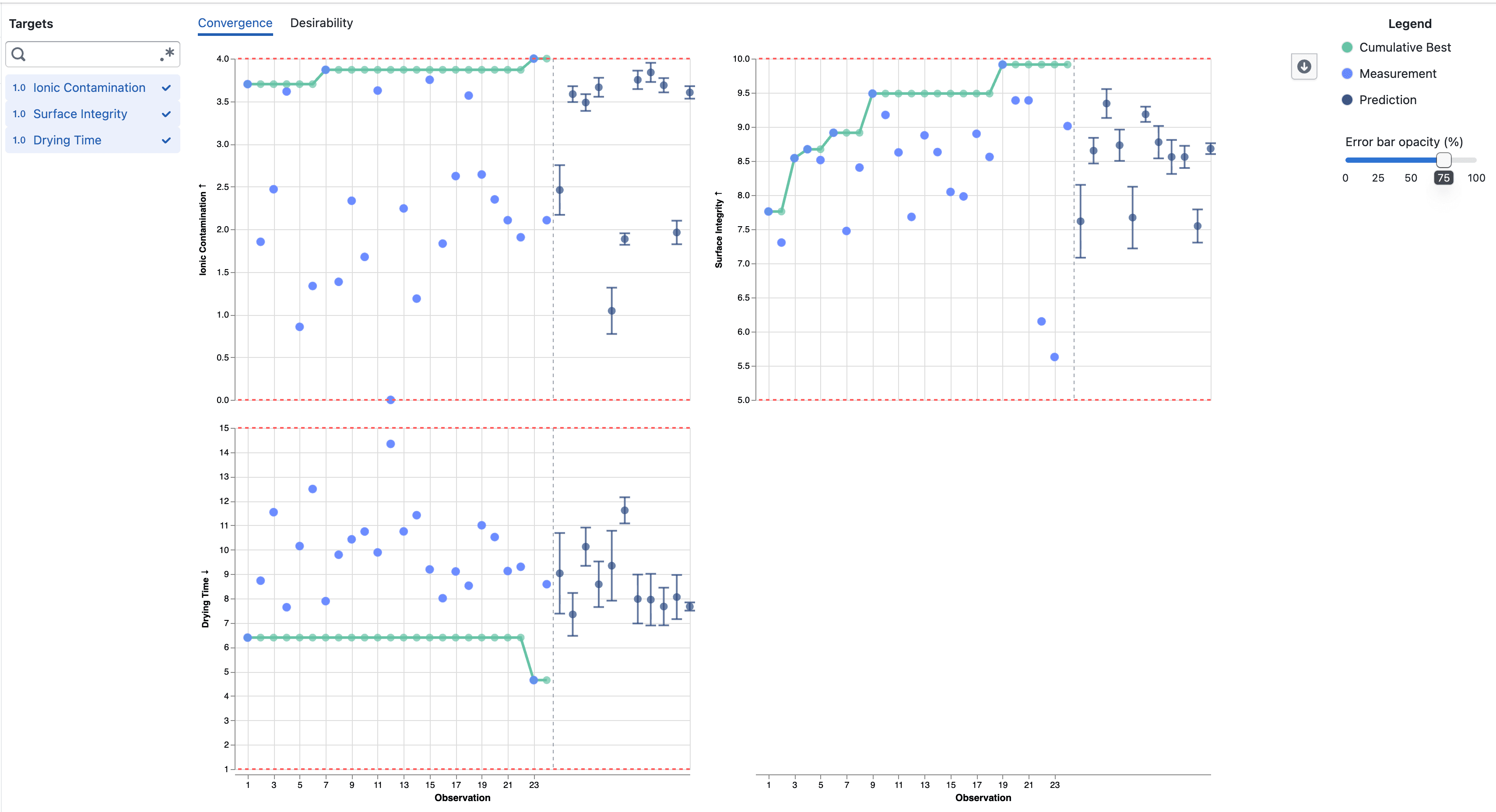
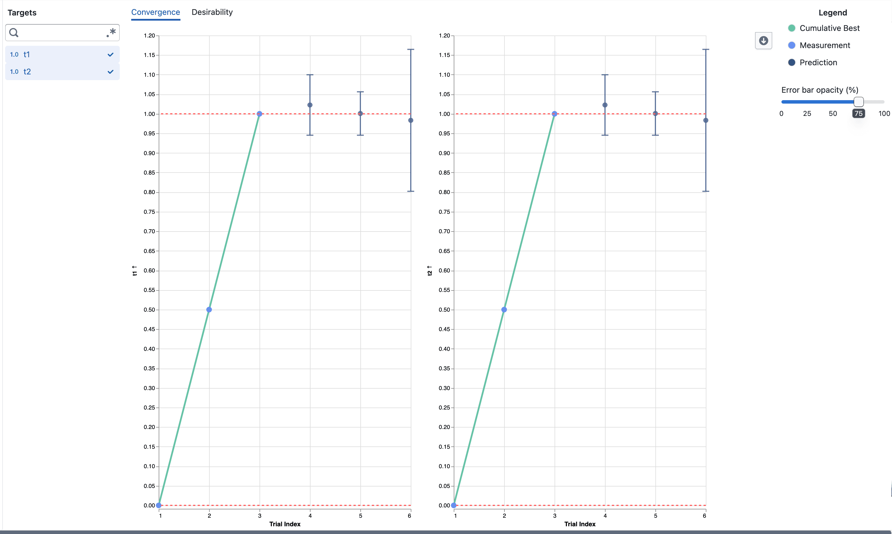
Convergence plots showing completed observations followed by predictions

  • Completed target results are numbered in completion order, without gaps from trials that did not produce a measurement
  • The original trial number and completion time remain available in the point details
  • Predictions for Pending and Accepted trials appear after the completed observations
  • A dashed divider separates measured results from predictions across selected targets

Notes

  • The observation number can differ from the original trial number when trials finish out of order or do not produce a target result
  • Predictions remain model estimates and include error bars showing one posterior standard deviation above and below the mean
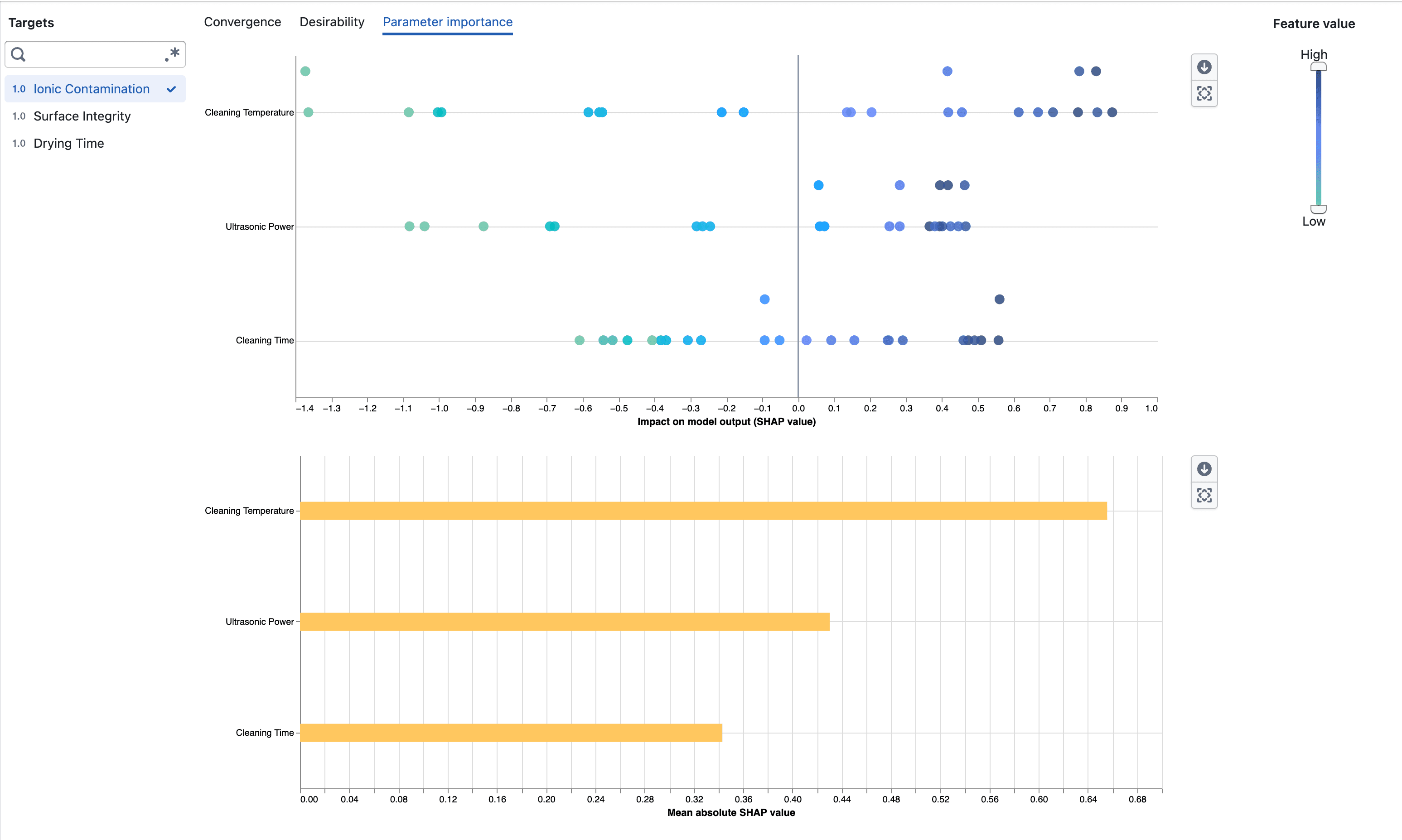
Understand what drives experiment predictions

Explore how each parameter influences experiment targets with SHAP-based importance visualizations.

What's included

Parameter importance

Parameter importance beeswarm and mean absolute SHAP charts

  • Open Parameter importance from an experiment's Visualization page
  • Select a target to inspect how its parameters contribute to the surrogate model output
  • Compare parameters using their mean absolute SHAP values
  • See the direction and distribution of each parameter's impact in the beeswarm plot
  • Use the feature-value scale to focus on observations with low or high numeric parameter values

Notes

  • Parameter importance requires enough completed measurements to fit the surrogate model
  • SHAP values describe model behavior and do not imply that a parameter causes a target outcome

Target predictions for open experiment trials

View BayBE target predictions and their uncertainty for Pending and Accepted trials.

What's included

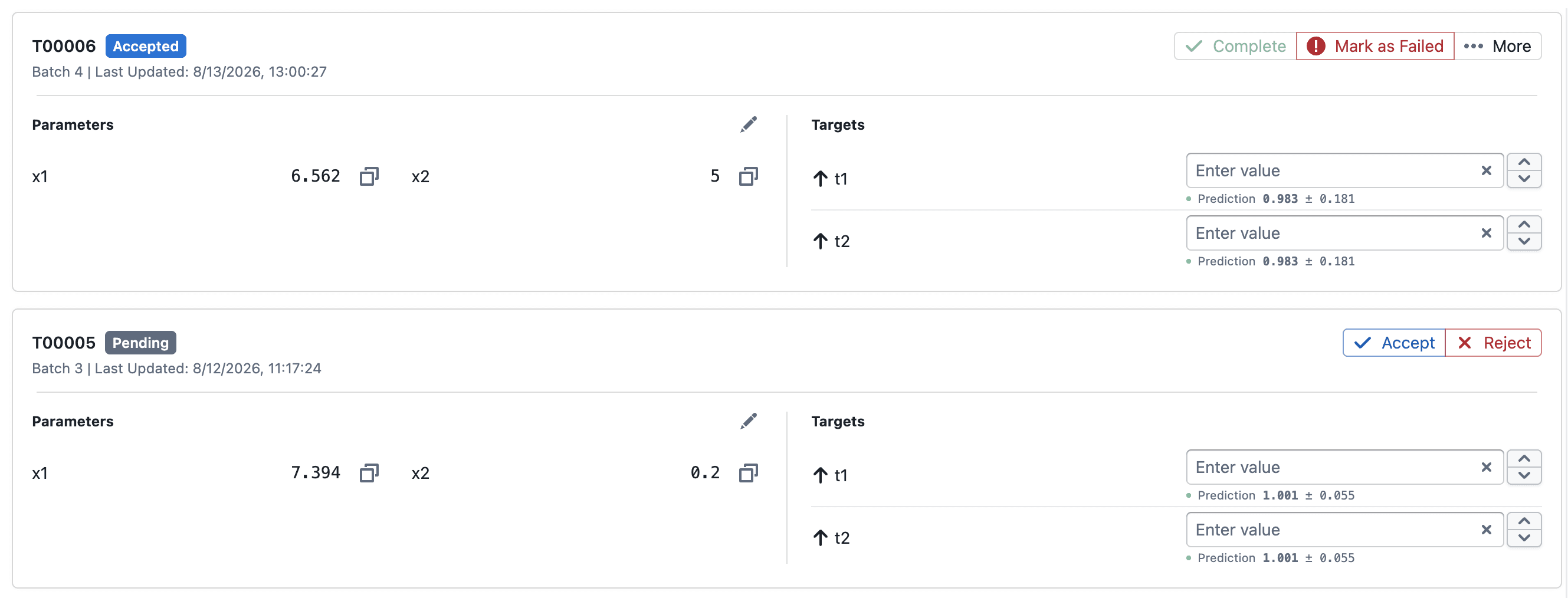
Predictions in trial cards

Predictions displayed for Pending and Accepted trial targets

  • Pending and Accepted trial cards show each target's predicted mean and posterior standard deviation as mean ± std
  • Predictions update as completed trial results are added to the experiment

Predictions in Convergence

Predictions and error bars in the Convergence visualization

  • Prediction points appear alongside completed measurements on the same target axis
  • Error bars extend from mean − std to mean + std to show model uncertainty
  • Hover over a prediction to inspect its value and error-bar bounds
  • Use Error bar opacity (%) to adjust the visibility of the error bars, including hiding them at 0%

Notes

  • Predictions are model estimates and are not measured target results
  • Error-bar bounds are not observed minimum and maximum values or a confidence interval

Sync Trials to Foundry Dataset

Sync your experiment trials to a linked Foundry dataset with one click, writing a snapshot of all trial data as a Parquet file.

What's included

Sync button on the trials page

The Views button in the study toolbar

A new Sync button sits in the top-right toolbar of the experiment trials page, next to the Add and Upload controls.

  • Click Sync to export all trials for the experiment to the linked Foundry dataset
  • The button shows a loading spinner while the sync runs and toasts the number of rows synced on completion
  • The button is disabled when there are no trials or no Foundry dataset is linked to the experiment

What gets synced

  • Only trials where all parameters are complete are included, regardless of state
  • Each sync overwrites the previous snapshot

Notes

  • The Sync button requires a Foundry dataset to be linked to the experiment at creation time
  • Each sync is a full snapshot — incremental/append writes are not currently supported

Desirability Convergence Chart

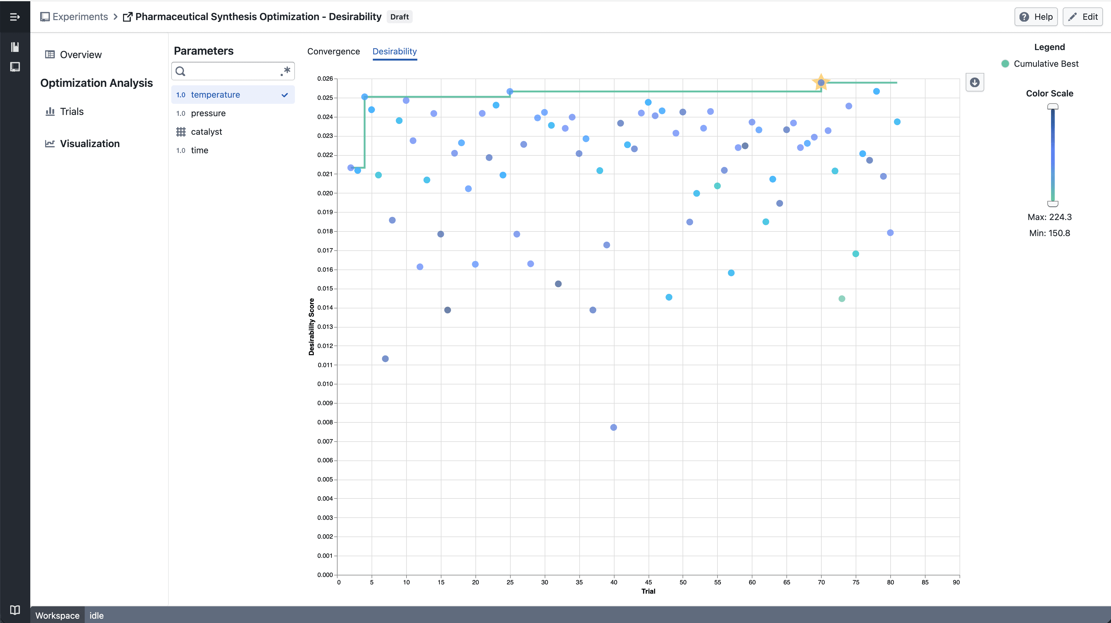
New desirability convergence chart for tracking optimization progress across experiment trials.

What's included

How it works

Numerical Parameter - select parameter

  • Select a numerical parameter from the parameter sidebar to color data points by that parameter's value
  • A continuous color scale shows how parameter values relate to desirability scores across trials
  • The best so far line tracks the highest desirability achieved up to each trial

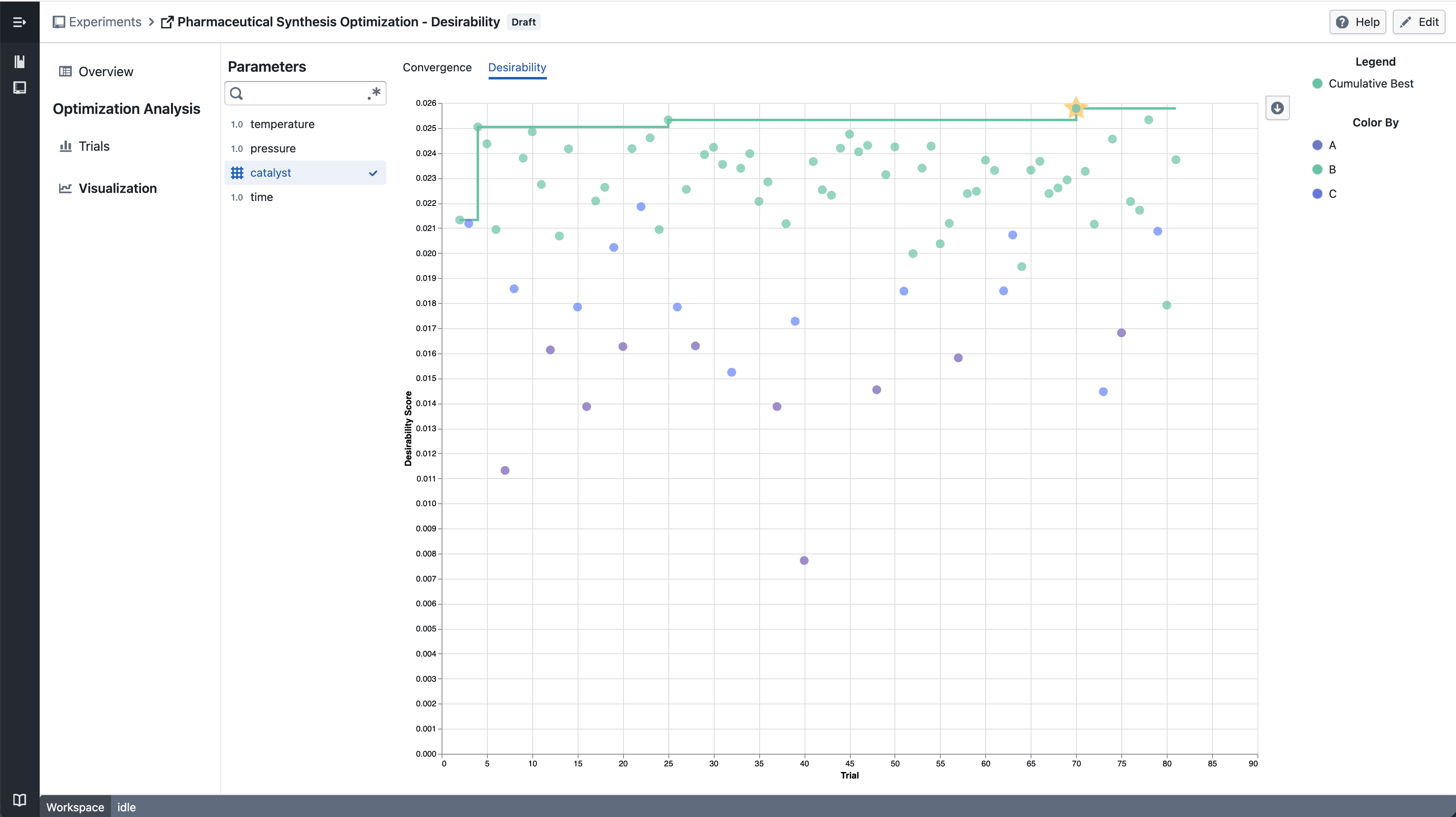
Categorical Parameter - select parameter

  • Select a categorical parameter to color data points by category
  • A discrete color legend identifies each category value

Notes

  • The convergence chart is available under the Desirability tab in the Visualization section
  • Chart interactions and layout may continue to evolve during the beta phase
  • If you notice any unexpected behavior, please share steps to reproduce

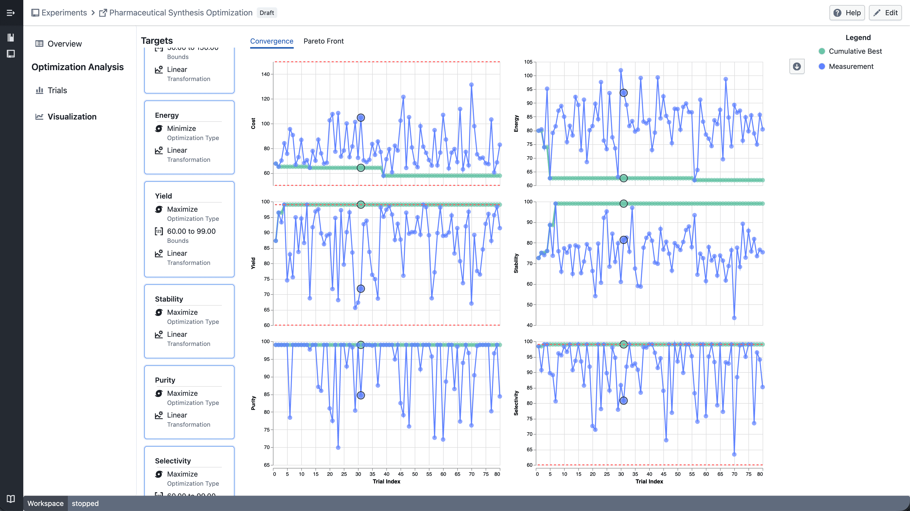
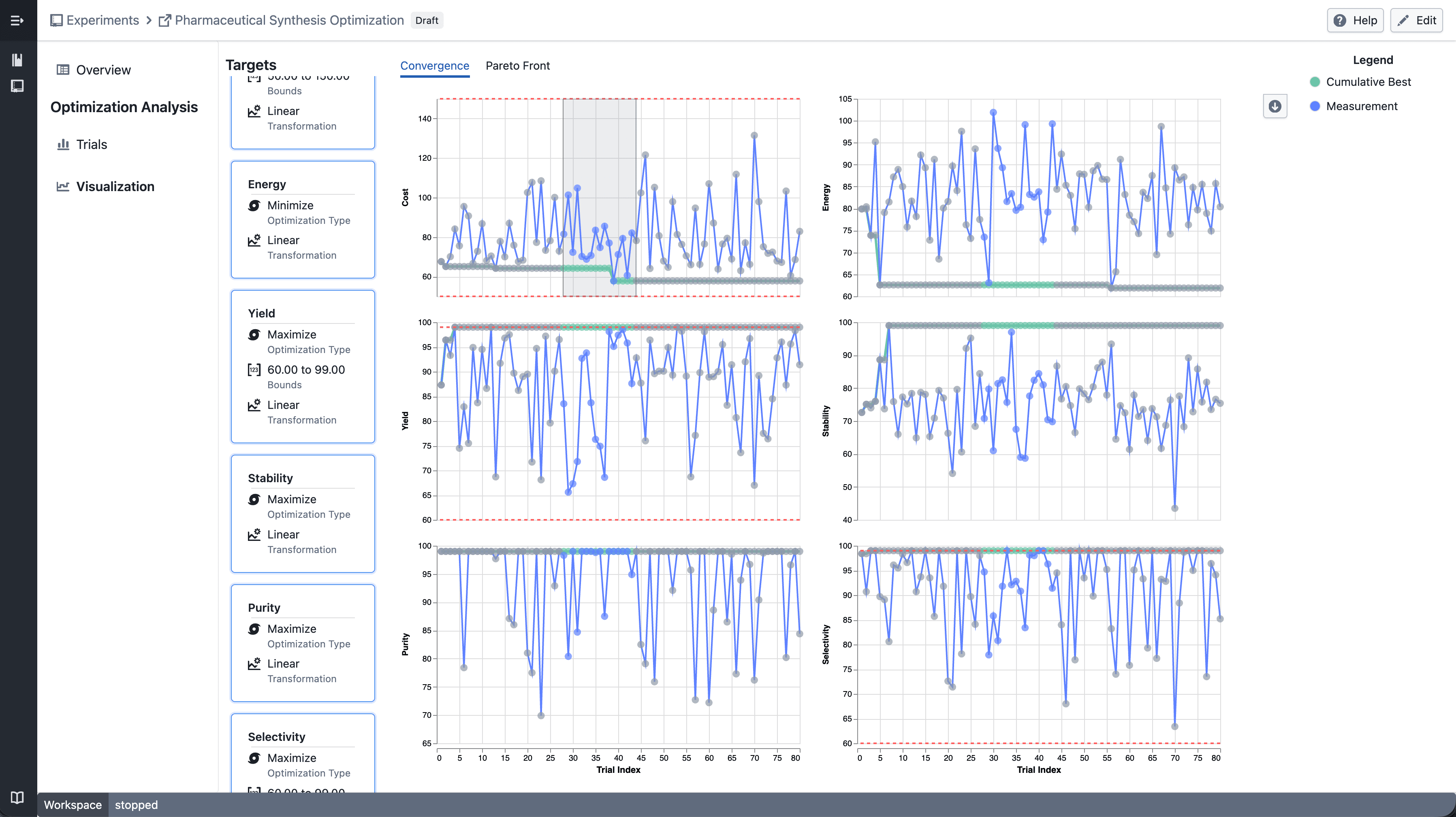
Trellis plots in Experiment Visualization Convergence

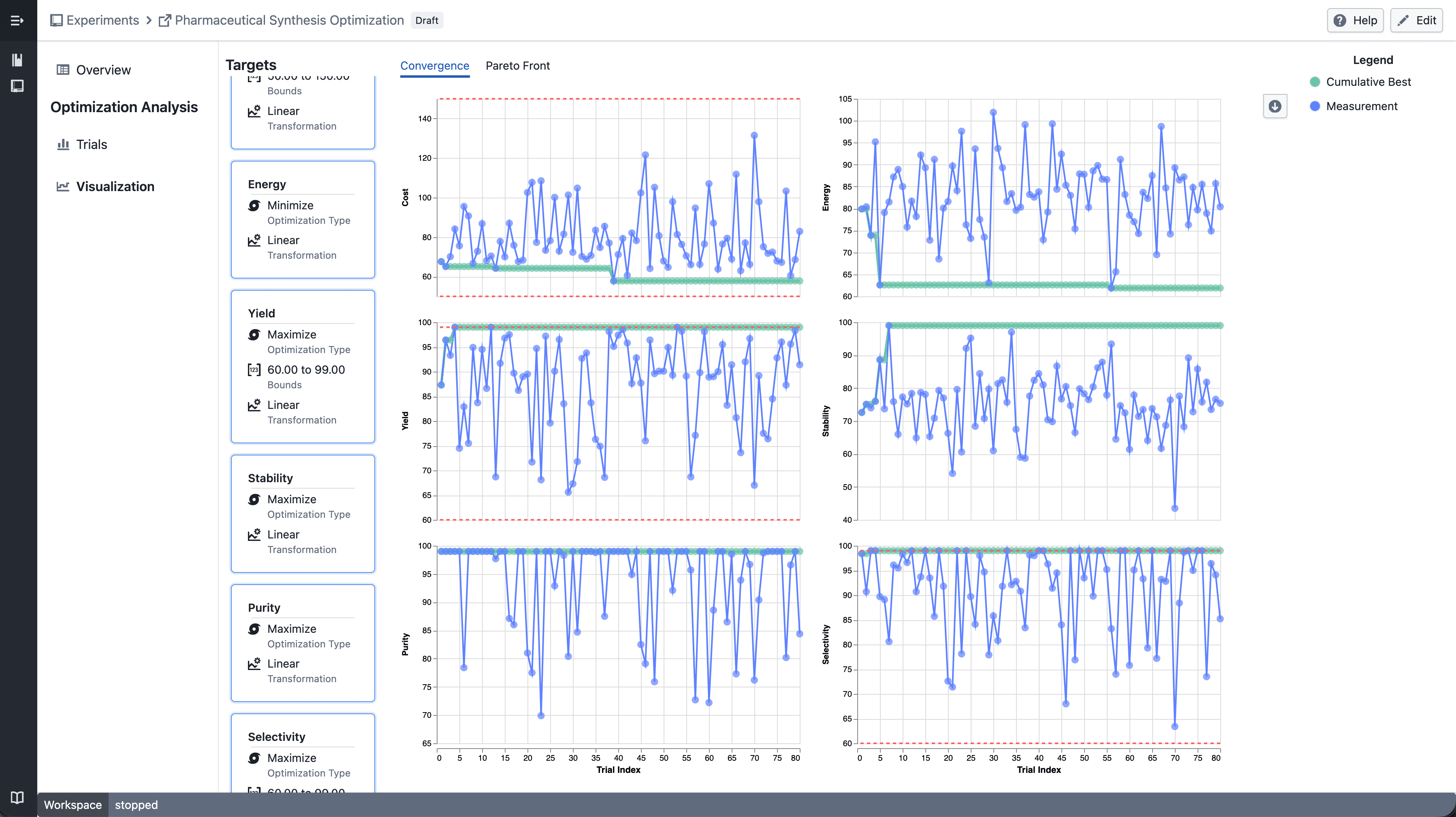
Split convergence plot into a multi-panel grid when multiple targets are selected.

What's included

How it works

Trellis convergence plot

  • Select multiple targets from the target sidebar
  • The convergence plot automatically splits into a grid — one panel per target
  • Each panel shares the same x-axis (iteration index) but has an independent y-axis scale

Trellis - select point

  • Click a data point to highlight the corresponding trial across all panels

Trellis - draw point

  • Shift-drag to draw a brush selection across panels
  • Points outside the selection are dimmed
  • Up to 6 targets can be displayed at a time

Notes

  • Single target selection continues to show the standard convergence plot
  • Trellis layout and interactions may continue to evolve during the beta phase
  • If you notice any unexpected behavior, please share steps to reproduce