Catalyst Assist
Ask questions about Catalyst and get instant, documentation-backed answers — right from the sidebar.
What's included
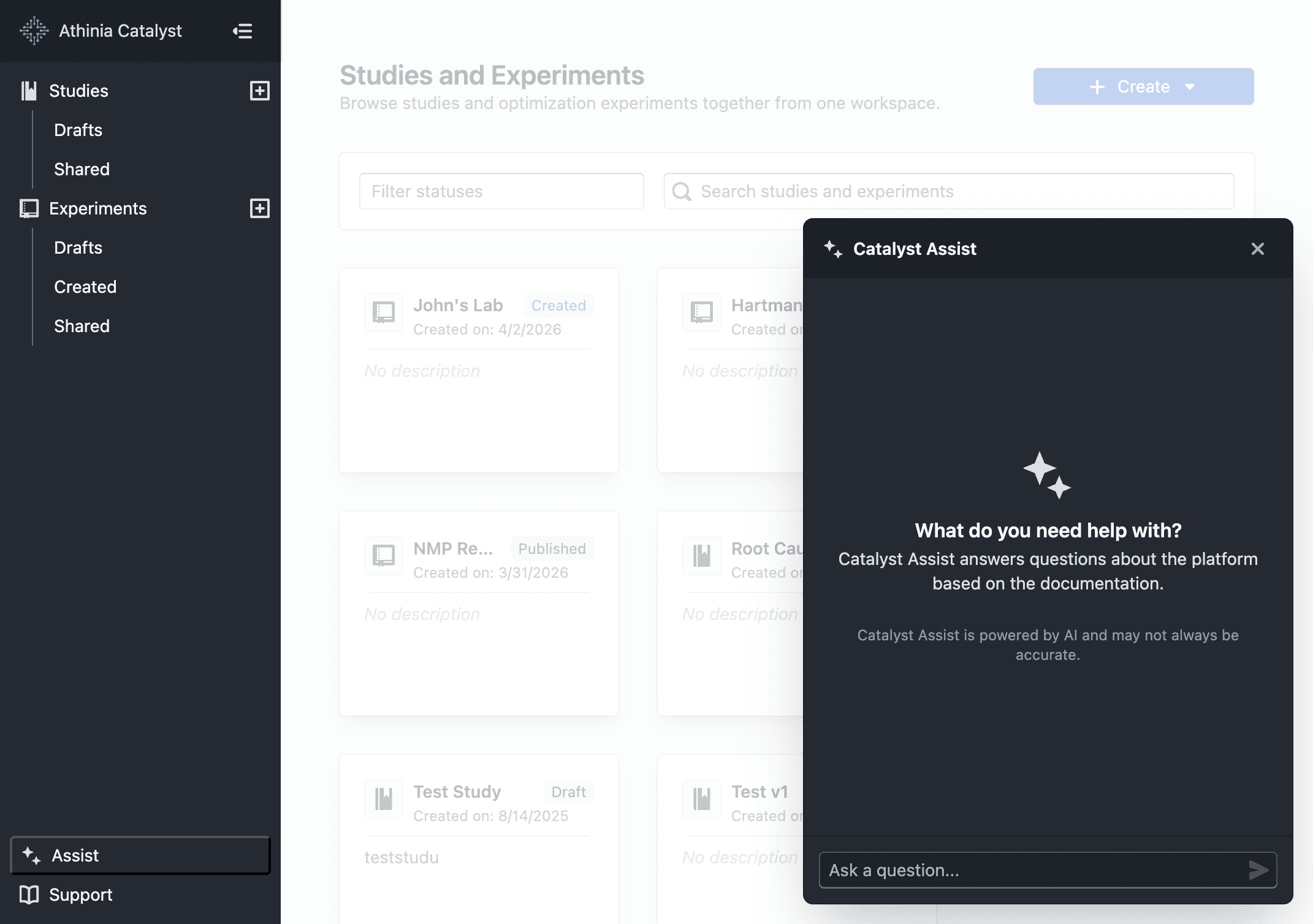
- Click Assist in the sidebar to open the panel from any page
- Ask a question and receive a focused, markdown-formatted answer grounded in Catalyst documentation
- Source excerpts are shown beneath each reply so you can verify or explore further
- Follow-up questions are supported — prior context is carried forward within the same conversation
- Use the + button to start a new conversation at any time
Notes
- Answers are based solely on Catalyst documentation — the assistant will not speculate or invent features
- AI responses may not always be accurate. When in doubt, refer to the official documentation for authoritative guidance
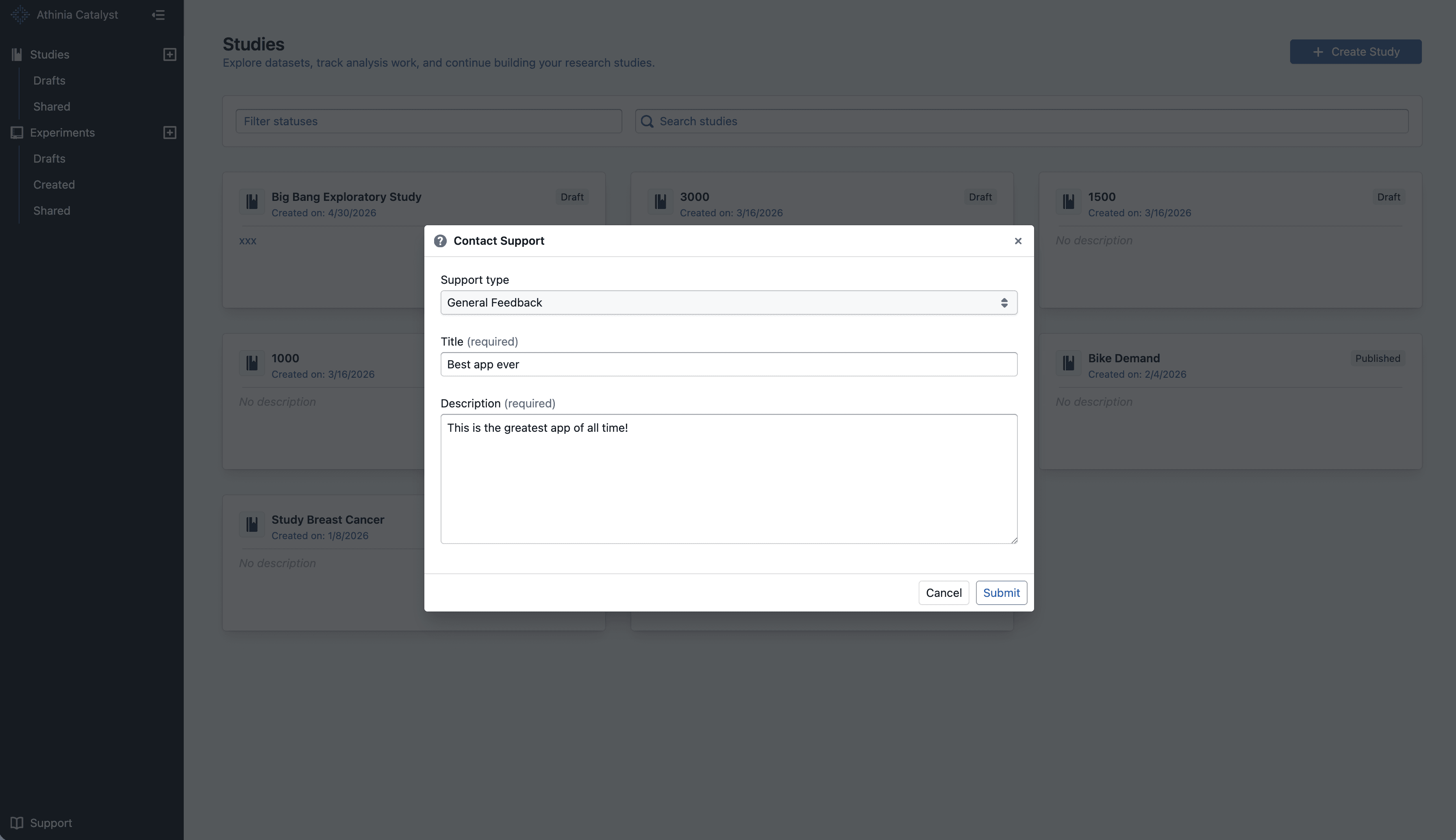
- If you receive an unexpected or unhelpful response, please share it via Support → Contact Support
- Conversations are limited to 20 messages; start a new one for unrelated topics