Isolation Forest
Access Athinia Catalyst at catalyst.athinia.io.
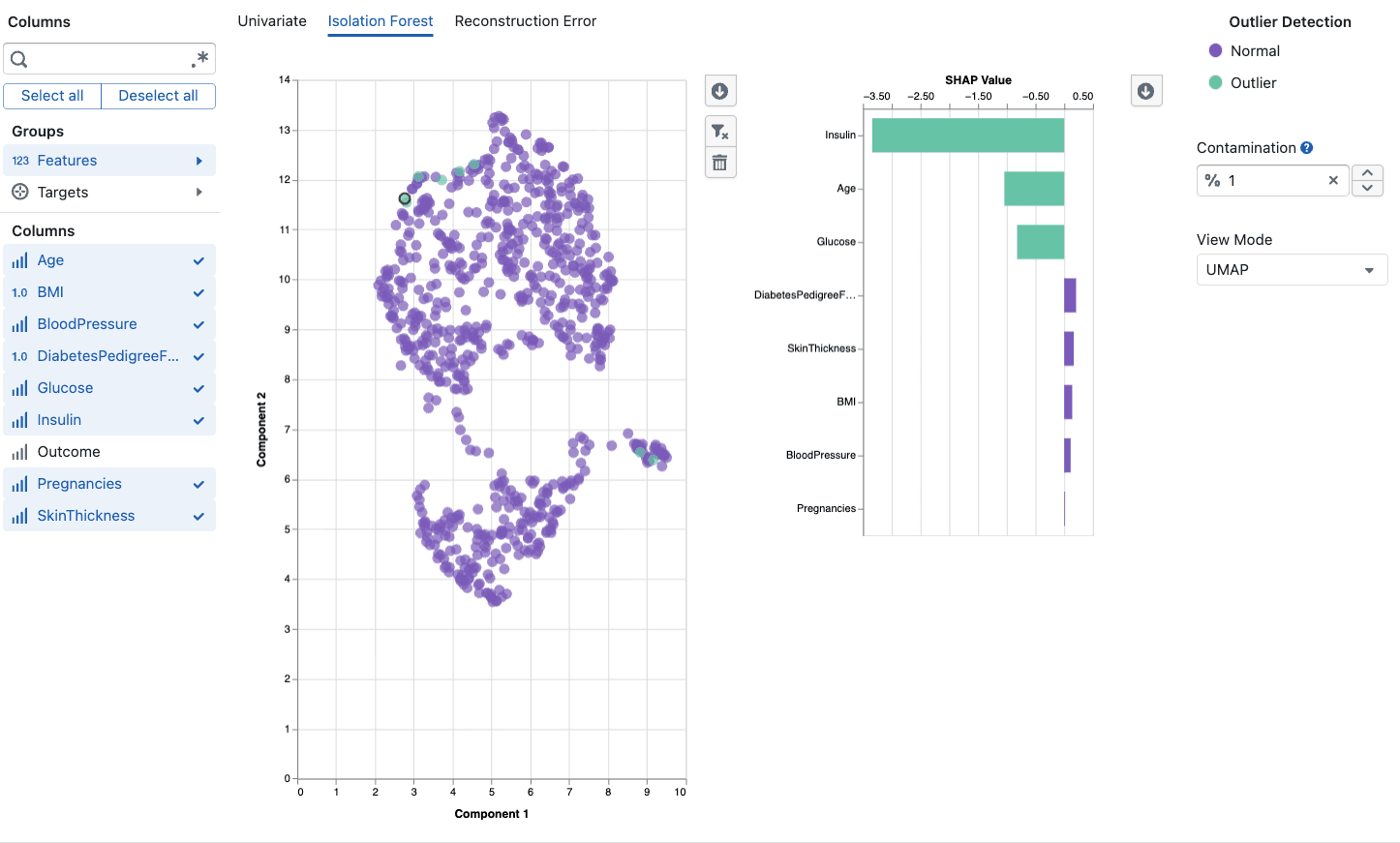
The Isolation Forest tool detects multivariate outliers by analyzing how data points relate to each other across multiple variables simultaneously. Unlike univariate methods that examine one column at a time, Isolation Forest identifies unusual combinations of values that might appear normal individually but are collectively anomalous. For example, a temperature of 380 degrees and a pressure of 2.1 bar might each be perfectly normal on their own, but their combination could be highly unusual for your process. This makes Isolation Forest particularly valuable for semiconductor manufacturing, where process quality depends on the interplay between many parameters rather than any single measurement in isolation. The algorithm works by repeatedly partitioning the data at random and measuring how quickly each point becomes isolated, assigning anomaly scores that you can explore through interactive UMAP, PCA, and table views.
Overview
Isolation Forest works by repeatedly partitioning the data at random. Outliers, being rare and different, require fewer partitions to be isolated from the rest of the data. The algorithm assigns an anomaly score to each data point, where higher scores indicate a higher likelihood of being an outlier.
This method is particularly effective for:
- Detecting complex multivariate anomalies that single-variable methods miss
- Handling high-dimensional datasets with many interacting features
- Identifying process deviations caused by unusual combinations of parameters
Key Features
Contamination Parameter
The contamination parameter controls the expected proportion of outliers in your dataset:
- Range: 0.01 to 0.50 (1% to 50%)
- Default: 0.01 (1%)
- Lower values: Flags only the most extreme anomalies
- Higher values: Flags more data points as potential outliers
Adjust this based on your domain knowledge about how frequently anomalies occur in your process.
View Modes
The tool provides three complementary views of your outlier detection results:
UMAP View (default)
- Projects high-dimensional data into a 2D scatter plot using UMAP dimensionality reduction
- Preserves local neighborhood structure, so similar data points remain close together
- Outliers typically appear as isolated points away from dense clusters
PCA View
- Projects data using the first two principal components
- Preserves global variance structure and captures the most important directions of variation
- Includes a confidence ellipse showing the expected normal range
Table View
- Displays raw anomaly scores alongside your data
- Sortable by anomaly score to quickly identify the most extreme outliers
- Useful for detailed investigation of specific data points
Column Selection
Select the numerical columns to include in the analysis:
- Choose variables that are relevant to your process or quality metrics
- At least two numerical columns are required
- The tool automatically filters to numerical data types (Float64, Int64)
- Use column groups to quickly select related features
SHAP Explanations
When you select a data point in the scatter plot, the tool provides a SHAP (SHapley Additive exPlanations) feature contribution chart:
- Shows which features most contributed to classifying the point as an outlier or normal
- Positive contributions push toward outlier classification
- Negative contributions push toward normal classification
- Helps you understand why a specific point was flagged
Smart Sampling
For large datasets, the tool automatically applies sampling to maintain responsive performance while preserving outlier detection accuracy.
Using the Tool
Basic Workflow
- Select Columns: Choose the numerical features relevant to your analysis (minimum 2)
- Set Contamination: Adjust the expected outlier proportion for your use case
- Choose View Mode: Start with UMAP for an overview, switch to PCA or Table for different perspectives
- Review Results: Examine the scatter plot where outliers are highlighted in a distinct color
- Investigate Points: Click on individual points to see their SHAP explanations
- Filter Out Outliers: Use the filter button to remove confirmed outliers from your dataset
Interpretation Guidelines
Scatter Plot:
- Points colored as outliers that cluster together may indicate a systematic issue
- Isolated outlier points far from all clusters are likely genuine anomalies
- Outliers near the boundary of normal clusters may be borderline cases worth investigating
SHAP Contributions:
- Large positive bars indicate features that strongly suggest the point is anomalous
- Look for patterns: if the same features consistently drive outlier classification, investigate those process parameters
- A single dominant feature suggests a univariate anomaly; multiple contributing features suggest a multivariate issue
Anomaly Scores:
- Higher scores indicate stronger anomaly signals
- The threshold between normal and outlier is determined by the contamination parameter
- Scores near the threshold are borderline, so consider investigating these manually
Best Practices
- Start with a low contamination (1-5%) and increase only if you expect more outliers
- Include relevant features because adding unrelated columns can dilute the signal
- Compare view modes since UMAP and PCA highlight different aspects of your data structure
- Use SHAP explanations to validate that flagged outliers make domain sense
- Combine with univariate analysis for comprehensive outlier detection
Frequently Asked Questions
How is Isolation Forest different from Univariate Outlier Detection?
Univariate methods analyze one column at a time, flagging values that are extreme for that individual variable. Isolation Forest analyzes multiple columns simultaneously, detecting unusual combinations of values. A data point might have normal values in every individual column but still be flagged by Isolation Forest because the combination is rare.
How many columns should I select?
Select columns that are relevant to the process or quality aspect you're investigating. Too few columns (less than 3) may not capture multivariate patterns. Too many irrelevant columns can dilute the signal. Start with 5-15 related process variables.
What contamination value should I use?
Start with the default of 1% unless you have prior knowledge about your outlier rate. For quality control in stable processes, 1-5% is typical. For exploratory analysis where you expect more anomalies, try 5-10%.
Why do UMAP and PCA views show different patterns?
UMAP preserves local neighborhoods (points that are similar stay close), while PCA preserves global variance (directions of maximum variation). Some outliers are more visible in one view than the other. Use both for a complete picture.
What does a SHAP explanation tell me?
SHAP explanations show which features contributed to classifying a specific point as an outlier. If a point is flagged and SHAP shows that "temperature" has a large positive contribution, it means that point's temperature value (in combination with other features) is a key reason it was classified as anomalous.
Can I use this with categorical data?
Isolation Forest requires numerical data. If you have categorical variables that are important for your analysis, consider using one-hot encoding or ordinal encoding before analysis.
How does the confidence ellipse in PCA view work?
The confidence ellipse represents the expected range of normal data based on the principal components. Points outside the ellipse are more likely to be outliers, though the actual classification is determined by the Isolation Forest algorithm, not the ellipse boundary.
What happens when I filter out a point?
Filtering removes the data point from your active dataset view. This allows you to iteratively clean your data by removing confirmed outliers and re-running the analysis on the remaining data.