Access Athinia Catalyst at catalyst.athinia.io.
Univariate Outlier Detection
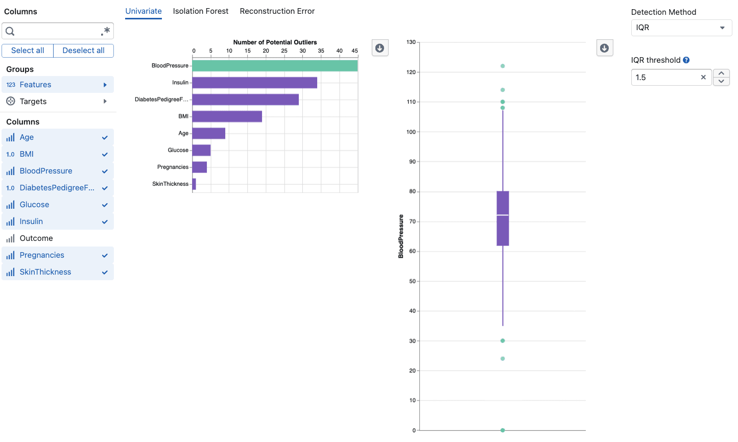
The Univariate Outlier Detection tool analyzes each variable independently to identify data points that fall significantly outside the expected range. This is the most straightforward approach to outlier detection: for each selected column, the tool calculates statistical boundaries and flags any values that exceed them. Because it operates on one variable at a time, it is easy to interpret and often the best starting point when you suspect individual measurements contain errors or extreme readings. The tool supports three statistical methods (IQR, MAD, and Z-Score), each with adjustable sensitivity, and provides both a summary overview showing outlier counts per column and detailed box plot visualizations for deeper investigation.
Methods
The tool offers three detection methods. Each defines a boundary around "normal" values and flags anything outside it.
| Method | Boundary Formula | Default Threshold | Best For |
|---|---|---|---|
| IQR | Q1 - (t × IQR) to Q3 + (t × IQR) | 1.5 | Skewed or non-normal data |
| MAD | Median ± (t × MAD) | 2.0 | Data with many extreme values |
| Z-Score | Mean ± (t × Std Dev) | 3.0 | Normally distributed data |
How to choose:
- Use IQR as a general-purpose default that works well with most distributions
- Use MAD when your data contains extreme outliers that might bias IQR calculations
- Use Z-Score when your data is approximately symmetric and normally distributed
Key Features
Column Selection
Select the numerical columns you want to analyze. The tool automatically filters to numerical data types (Float64, Int64).
- Use column groups to quickly select related fields
- Search for specific columns by name
- Select or deselect individual columns with checkboxes
Threshold Control
The threshold controls sensitivity across all methods:
- Range: 1.0 to 5.0 (adjustable in 0.25 increments)
- Lower values: More sensitive, flags more potential outliers
- Higher values: Less sensitive, flags only extreme deviations
Start with the default for your chosen method and adjust based on results. Lower the threshold when data quality is critical, raise it when working with naturally variable data.
Summary View
Displays a bar chart of outlier counts per column:
- Columns sorted by outlier count (highest first)
- Paginated for large datasets (30 columns per page)
- Click on bars to select columns for detailed analysis
- Updates in real time as you adjust the threshold
Detailed Analysis
Select up to 10 columns from the summary to see box plot visualizations showing:
- Data distribution boundaries (Q1 to Q3)
- Individual outlier values and their positions
- Statistical context based on the selected method
Using the Tool
- Choose a method based on your data characteristics (see table above)
- Select columns relevant to your analysis
- Adjust the threshold if the default sensitivity is too high or too low
- Review the summary to identify which columns have the most outliers
- Click bars to select columns for detailed box plot analysis
- Investigate patterns to determine if outliers are errors or valid observations
Frequently Asked Questions
How do I choose between the three methods?
Consider your data distribution. For general use, start with IQR. If your data has extreme values that might skew the IQR calculation, switch to MAD. If your data is well-behaved and approximately normal, Z-Score provides the most interpretable boundaries.
What threshold should I use?
Start with the method's default (IQR: 1.5, MAD: 2.0, Z-Score: 3.0). Lower it if you need higher sensitivity for critical quality applications. Raise it if you are seeing too many false positives or working with naturally variable data.
Why can't I see all my columns?
Only numerical columns (Float64, Int64) are available for outlier analysis. Text and categorical columns are automatically filtered out.
What does "No outliers found" mean?
All values in the selected columns fall within the normal range at your current threshold. Try lowering the threshold if you expected to find outliers.
How many outliers is too many?
As a general rule: less than 5% is typical for most datasets, 5 to 10% may indicate data quality issues, and more than 10% likely indicates systematic problems worth investigating.
Why is the detailed view empty?
The detailed view only shows data after you click on bars in the summary chart. Select up to 10 columns to compare their distributions.