Correlations
Access Athinia Catalyst at catalyst.athinia.io.
Overview
The Correlation Analysis tool allows you to explore relationships between variables in your dataset. This powerful component offers two primary views:
- Correlation Matrix - Visualize correlation strength between multiple variables at once
- Ranked Correlation - Examine individual variables and their strongest correlations
Correlation Matrix View
The Correlation Matrix displays relationships between multiple variables simultaneously in a heat map format.
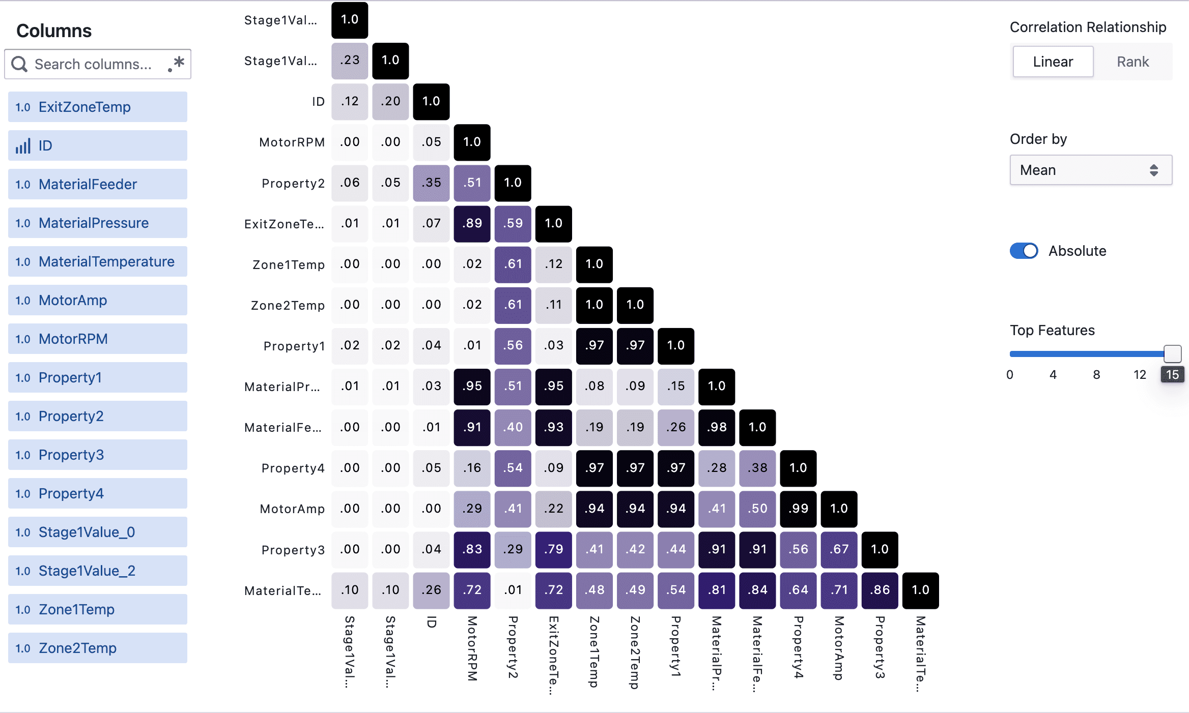
Key Features
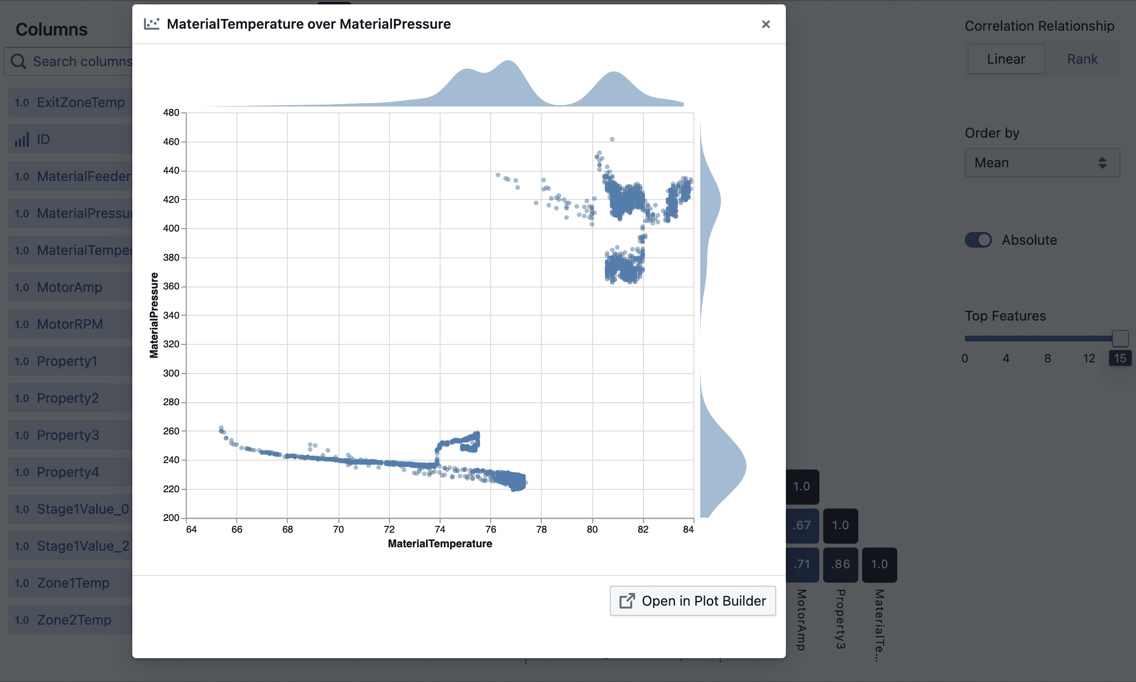
- Interactive Heat Map: Click on any cell to view a scatter plot of that specific variable pair
- Color Coding: Darker colors indicate stronger correlations (positive or negative)
- Correlation Values: View exact correlation coefficients within each cell
- Variable Selection: Choose which variables to include in your analysis
- Flexible Scaling: Handles virtually any number of features, automatically adjusting display
Options
-
Correlation Relationship:
- Linear (Pearson): Measures linear relationships between variables
- Rank (Spearman): Detects monotonic relationships, even if non-linear
-
Order By: Sort variables by:
- Mean: Average correlation strength across all pairs
- Median: Middle value of all correlations
- Max: Strongest correlation
- Alphabetical: Sort by variable name
-
Absolute: Toggle to view absolute correlation values (ignoring positive/negative direction)
-
Top Features: Use the slider to control how many variables to display
Ranked Correlation View
The Ranked Correlation view shows the strongest correlations for each selected variable.
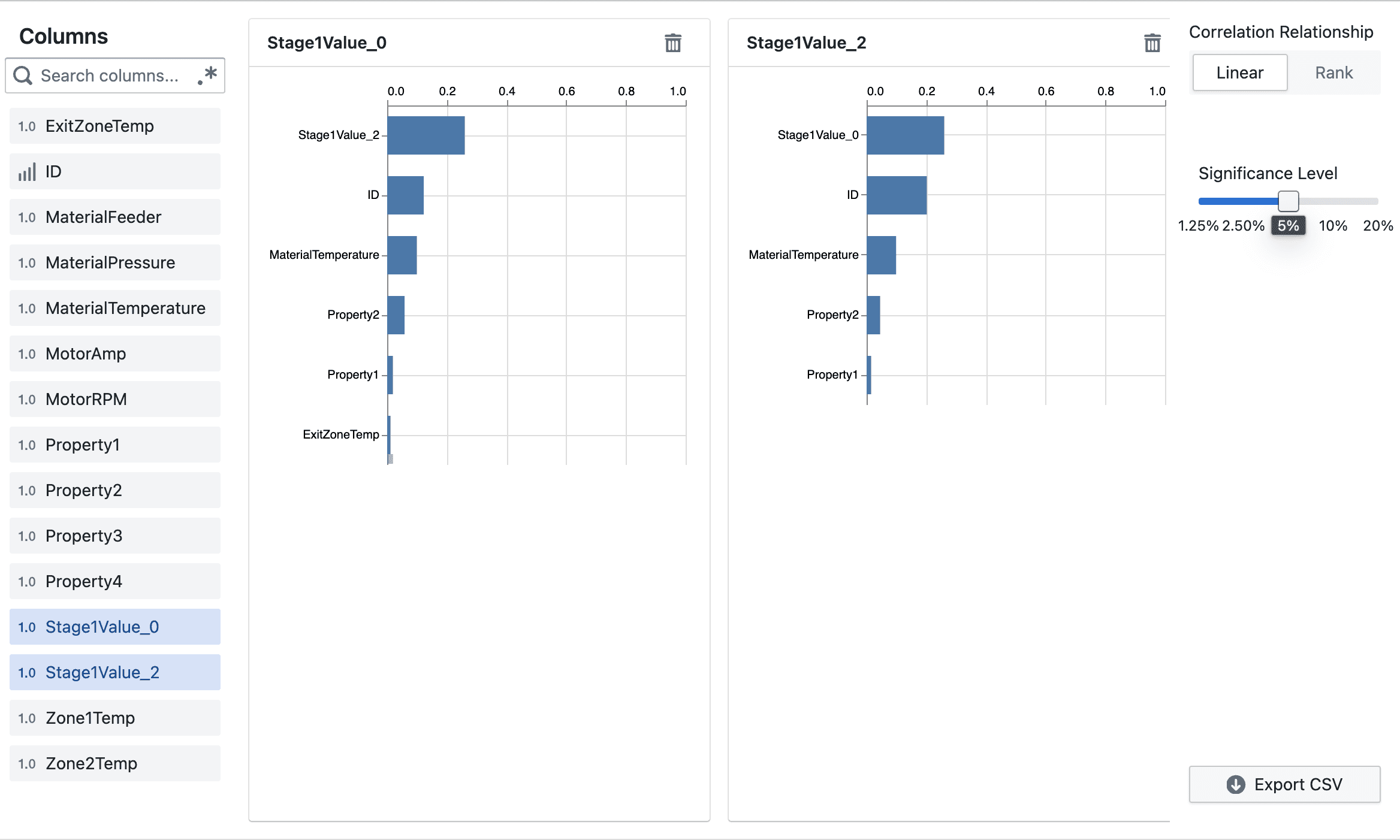
Key Features
- Bar Charts: See the strength of correlation between a target variable and other variables
- Multiple Targets: Select multiple target variables to view side-by-side
- Interactive: Click on any bar to see a detailed scatter plot
- Statistical Significance: Filter by p-value to show only significant correlations
Options
- Correlation Relationship: Choose between Linear (Pearson) or Rank (Spearman)
- Significance Level: Adjust the p-value threshold to filter correlations by statistical significance
- Export CSV: Download your correlation data for further analysis
Working with Large Datasets
This tool is designed to handle datasets with many variables:
- For the Matrix view, use the "Top Features" slider to focus on the most important variables
- For very large datasets, the tool automatically adapts the visualization
- When many features are present, hover over cells to see correlation values
Advanced Analysis
-
Discovering Relationships:
- Look for dark blue cells to find strong positive correlations
- Look for dark cells to find strong negative correlations
-
Drilling Down:
- Click on any interesting correlation to open a scatter plot
- Use "Open in Plot Builder" to customize visualizations further
-
Variable Filtering:
- Use the column selector on the left to focus on specific variables
- Toggle variables on/off to compare different sets of relationships
By leveraging these visualization tools, you can quickly identify patterns and relationships in your data, regardless of dataset size.
Frequently Asked Questions
What is the Correlation Analysis tool used for?
The Correlation Analysis tool helps you discover and visualize relationships between variables in your dataset. It shows how strongly pairs of variables are related to each other, allowing you to identify patterns and dependencies.
What's the difference between the Matrix and Ranked views?
The Matrix view displays all correlations between selected variables in a heat map format, giving you a comprehensive overview. The Ranked view focuses on showing the strongest correlations for specific target variables you select, presented as bar charts.
Can I use this tool with categorical data?
The Correlation Analysis tool works primarily with numerical data. Categorical variables need to be encoded numerically before correlation analysis can be performed.
How do I interpret the colors in the Matrix view?
Darker blue indicates a strong positive correlation (variables increase together), while darker black indicates a strong negative correlation (one variable increases as the other decreases). Light or white areas show little to no correlation.
How do I see the exact correlation value?
Hover over any cell in the Matrix view to see the exact correlation coefficient between those two variables.
How do I view a scatter plot for specific variables?
Click on any cell in the Matrix view or any bar in the Ranked view to open a scatter plot of those two variables.
What does the p-value threshold in Ranked view control?
The p-value threshold filters correlations based on statistical significance. Only correlations with p-values below your selected threshold will be shown, reducing the chance of seeing spurious correlations.
What's the difference between Linear and Rank correlation?
Linear (Pearson) correlation measures the strength of linear relationships between variables. Rank (Spearman) correlation measures monotonic relationships (variables tend to change together, but not necessarily at a constant rate), making it better for detecting non-linear relationships.
Why do some correlations appear as 1.0?
A correlation of 1.0 indicates a perfect positive relationship. This always occurs when comparing a variable with itself, but can also happen when two variables have exactly the same pattern of values.
How many variables can I analyze at once?
The tool can handle many variables, but visual clarity decreases with large numbers. For the Matrix view, use the "Top Features" slider to focus on the most important variables. The Ranked view lets you select specific target variables of interest.
How can I download my correlation results?
In the Ranked view, use the "Export CSV" button to download your correlation data for further analysis or reporting.
Why are some cells empty in the Matrix view?
Empty cells may appear if correlation couldn't be computed due to missing data or constant values in one or both variables.
The correlation values seem unexpected. What might be wrong?
Unexpected correlations can result from outliers, non-linear relationships, or confounding variables. Try:
- Using Rank correlation instead of Linear
- Investigating scatter plots of the variables
- Checking for data quality issues