Statistics
Access Athinia Catalyst at catalyst.athinia.io.
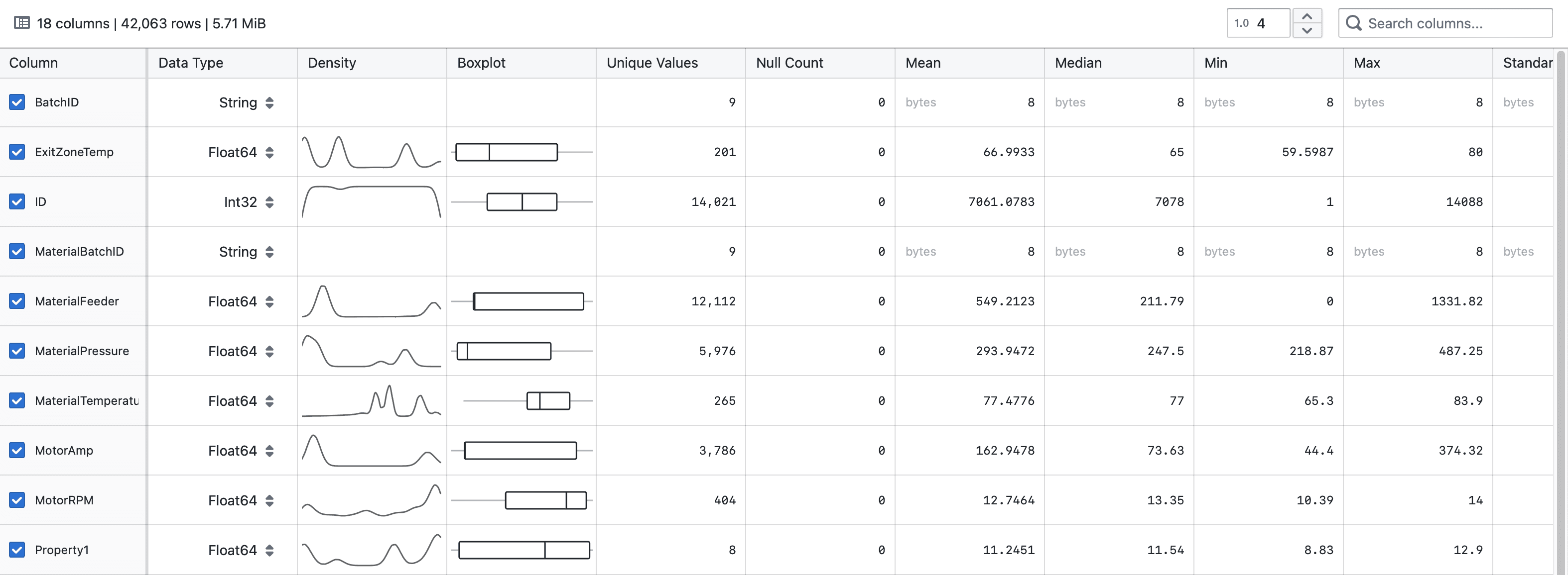
The Statistical Data Explorer provides a comprehensive view of your dataset's statistics, helping you understand your data's characteristics at a glance. The component displays key metrics for each column in your dataset, allowing you to quickly identify patterns, outliers, and data quality issues.
Key Features
Data Overview
At the top of the component, you'll see a summary of your dataset showing:
- Total number of columns
- Total number of rows
- Dataset size in MiB
Filtering
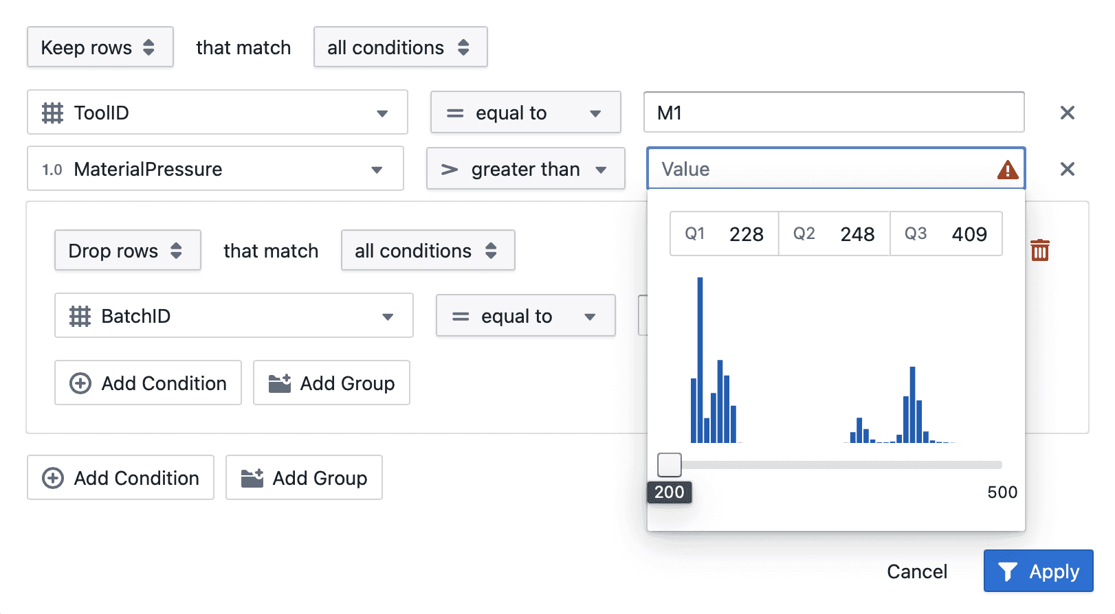
Use the Filter component to filter your dataset based on specific conditions. The statistics will update immediately to reflect the filtered dataset.
Column Statistics
For each column in your dataset, the following information is displayed:
- Column: The name of each data field with selection checkboxes
- Data Type: The data type of the column (String, Float64, Int32, etc.)
- Density: A sparkline visualization showing the distribution of values
- Boxplot: A visual representation of the five-number summary (minimum, first quartile, median, third quartile, maximum)
- Unique Values: The count of distinct values in the column
- Null Count: The number of missing values, shown as both count and percentage
- Mean: The average value (for numerical columns)
- Median: The middle value (for numerical columns)
- Min: The minimum value in the column
- Max: The maximum value in the column
- Standard Deviation: The measure of dispersion in the data (for numerical columns)
- Q1: The first quartile value
- Q3: The third quartile value
Using the Component
Searching for Columns
Use the search box in the top-right corner to quickly find specific columns by name. The table will automatically filter to only show matching columns.
Adjusting Precision
The numeric input field with the "floating-point" icon allows you to adjust the number of decimal places shown for numeric values. You can set any value between 0 and 38 to control the display precision.
Column Selection
Use the checkboxes in the first column to select specific columns for further analysis or operations.
Visualizing Distributions
The Density column shows sparklines that visualize the distribution of values in numerical columns. This helps you quickly identify patterns such as:
- Normal distributions (bell curves)
- Skewed distributions
- Bimodal or multimodal distributions
- Uniform distributions
Understanding Boxplots
The boxplots visually represent the five-number summary:
- The vertical line inside the box represents the median
- The left edge of the box represents the first quartile (Q1)
- The right edge of the box represents the third quartile (Q3)
- The horizontal lines (whiskers) extend to the minimum and maximum values
Tips for Effective Use
-
Data Quality Assessment: Check the "Null Count" column to quickly identify fields with missing values.
-
Outlier Detection: Look at the boxplots to spot potential outliers that extend beyond the whiskers.
-
Distribution Analysis: Examine the density sparklines to understand the distribution shape of your numerical data.
-
Data Type Verification: Review the "Data Type" column to ensure your columns have the appropriate data types for your analysis.
-
Column Filtering: Use the search box when working with datasets that have many columns to focus on specific fields of interest.
The Statistical Data Explorer is designed to give you immediate insights into your data structure and quality, setting the foundation for more advanced analysis within the data science module.
Frequently Asked Questions
Why don't I see density plots for some of my columns?
Density plots are only generated for numerical data types. Categorical and String columns don't have density visualizations since these distribution representations only make sense for continuous data.
What does the percentage in the "Null Count" column represent?
This percentage shows what portion of the total dataset is missing for that particular column. It helps you quickly assess data completeness.
How are the boxplots calculated?
Boxplots represent the five-number summary of your data: minimum, Q1 (25th percentile), median (50th percentile), Q3 (75th percentile), and maximum. The box itself spans from Q1 to Q3, with a line at the median.
Why do some numeric values show "bytes" next to them?
For String and Categorical data types, the numeric values represent the byte size of the data stored in that column rather than the actual data values.
How can I export these statistics?
Currently, the statistics are presented for visual analysis within the interface. If you need to export them, consider using the data science module's export functionality available in other parts of the application.
What happens if my dataset is empty?
If your dataset has no rows (possibly due to filtering conditions), you'll see a message indicating "Dataset is empty" with a suggestion to remove filter conditions.
Why do some values appear truncated?
You can adjust the precision of displayed values using the numeric input with the floating-point icon in the top-right corner. This controls how many decimal places are shown for numeric values.
Can I change the data type of a column?
The data types shown in the Data Explorer are informational. To modify data types, you'll need to use the data transformation features available elsewhere in the application.