Access Athinia Catalyst at catalyst.athinia.io.
Survival Analysis
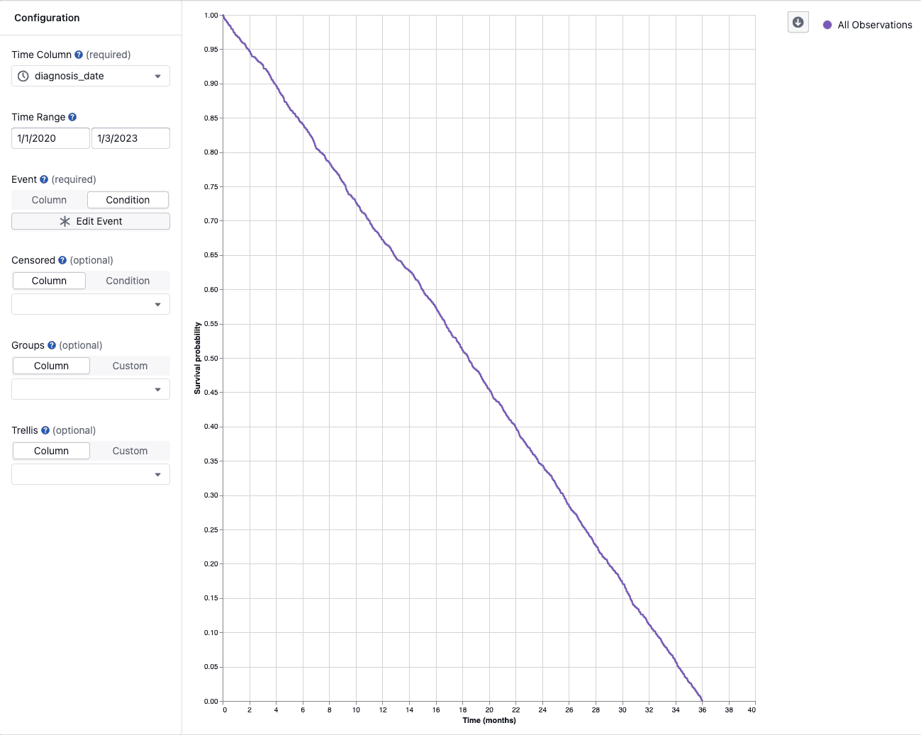
The Survival Analysis module lets you visualize and compare how long it takes for an event of interest to occur across subjects in your study using Kaplan-Meier (KM) curves. It is designed for studies tracking outcomes such as disease progression, compound response, or specimen failure — including studies where some subjects leave before the outcome is observed.
Overview
A Kaplan-Meier curve starts at 100 % and steps downward each time an event occurs. The y-axis shows survival probability — the percentage of subjects who have not yet experienced the event — and the x-axis shows time. Small tick marks on the curve indicate censored subjects: those whose follow-up ended before the event was observed (for example, the subject left the study early, or the study ended before their event occurred).
Key Features
Survival curve visualization
- Curves step downward each time an event occurs, showing survival probability over time
- Small tick marks on the curves indicate censored subjects — those whose follow-up ended before the event was observed
- Hover over any point on the curve to see a detailed tooltip
- Download the plot using the toolbar button
Interactive tooltip
When you hover over a curve, the tooltip shows:
- Time — the elapsed time at that point, shown as a number in the axis unit (days, months, or years)
- Date (date/datetime columns only) — the original calendar date corresponding to this time point
- Survival probability — the estimated percentage of subjects who have not experienced the event by this time
- At risk — the number of subjects who have not yet experienced the event and are still being observed at this time point
- Events — the number of events that occurred at this time point
- Censored — the number of subjects who were censored at this time point
- Group — the group label (when comparing multiple groups)
Group comparisons
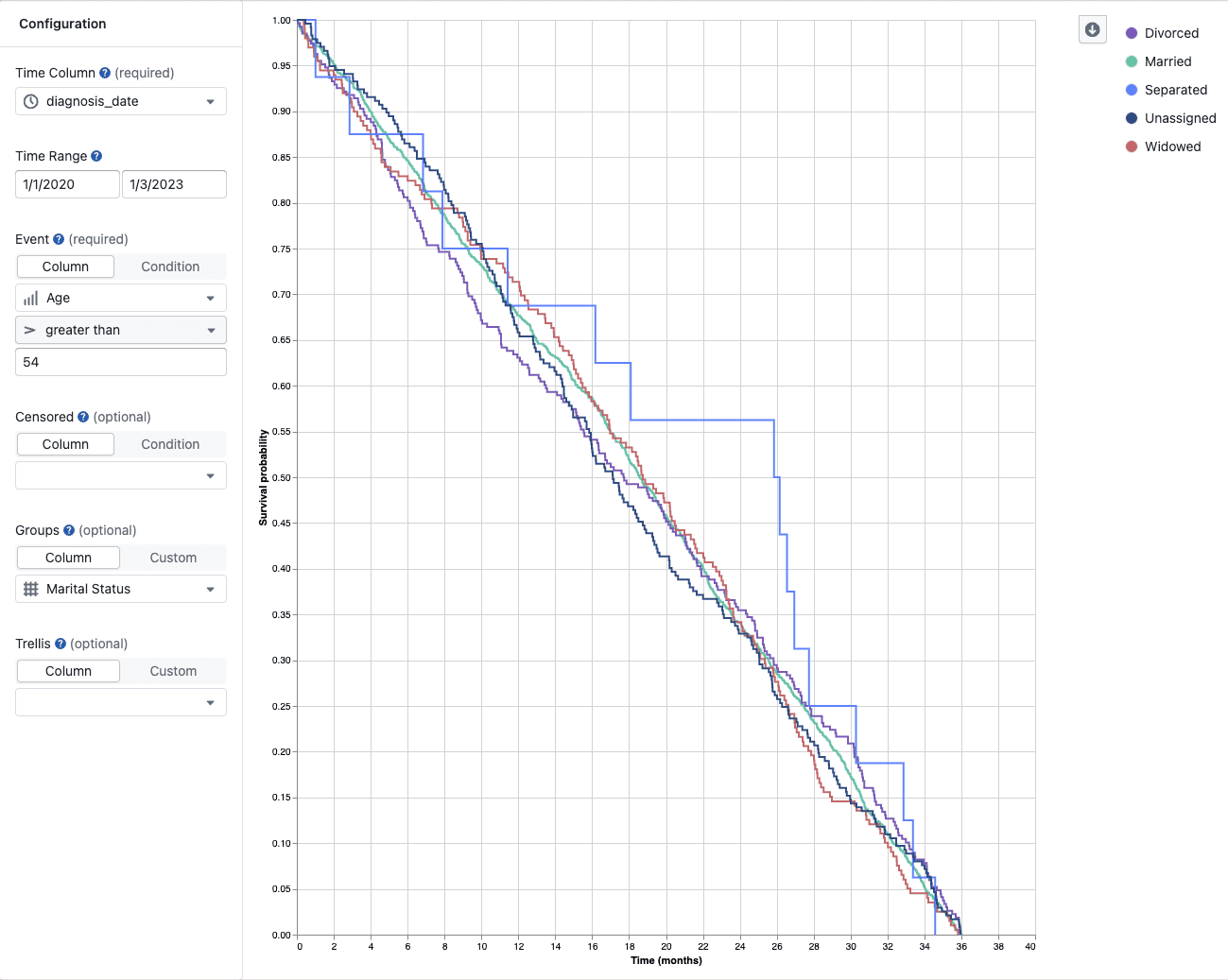
- Compare subgroups (e.g., treatment arms, dose levels, compound classes) using color-coded curves
- Each group is displayed as a color-coded curve with a label in the legend
- Subjects not matched by any group filter are automatically shown in an Unassigned group, provided at least one of your defined groups matched some data
- Click a legend item to toggle that group on or off; double-click to isolate it; clicking off the last visible group resets all groups back to visible
Multi-panel (trellis) plots
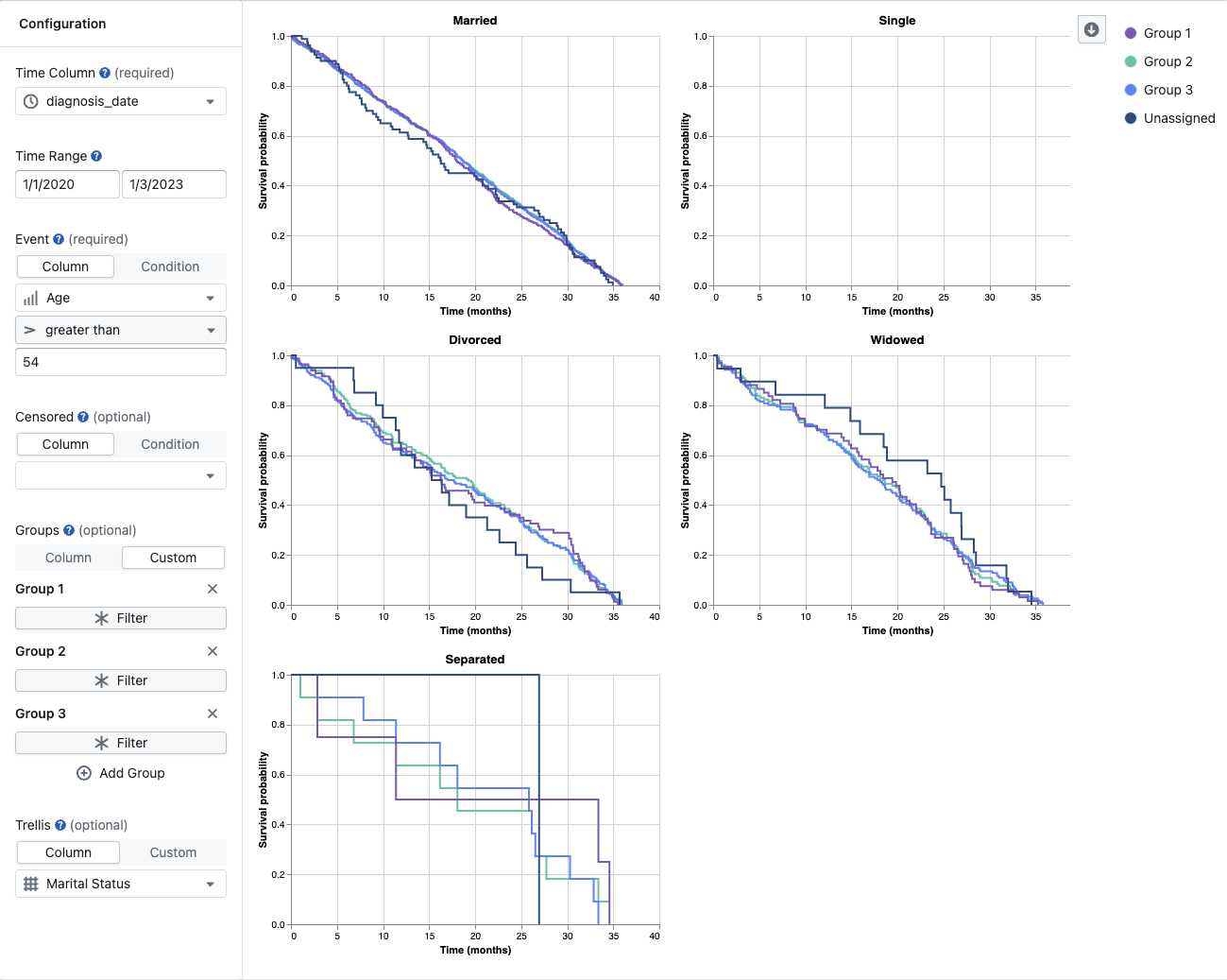
- Split the plot into a grid of panels, one per subset of your data, to compare effects across a third variable (e.g., species, cell line, batch)
Configuration
The configuration panel is on the left side of the screen. The two required fields are Time Column and Event Condition; all other fields are optional.
The Event, Censored, Groups, and Trellis sections each offer two modes. Column mode is the simpler option — pick a column and a value. Condition / Custom mode opens the full filter builder for more complex logic.
Time Column (required)
Select the column that represents the time axis. The column must be numeric (integer, float, or decimal) or a date / datetime type. String and duration columns are not supported.
- For numeric time columns, the x-axis shows the raw numeric values
- For date/datetime columns, the x-axis shows elapsed time since the start of the selected time range, labeled in days, months, or years depending on the range length
Time Range
Restrict the analysis to a specific window of time. Only rows whose time value falls within this range are included.
- For numeric columns, enter minimum and maximum values directly
- For date/datetime columns, use the date-range picker to select a start and end date
The analysis starts from the start of the selected time range, where survival probability is set to 100 %.
Event Condition (required)
Define which rows represent the event of interest.
- Column — select a column, an operator (e.g.
=,≠), and a value. Best for binary or flag columns such asstatus = "dead"orevent_occurred = true. - Condition — click Define Event to build a multi-rule filter for more complex logic.
Rows that match cause the survival curve to step down.
Censored Condition (optional)
Define which rows represent a censored subject — one whose follow-up ended before the event occurred.
- Column — select a column, operator, and value using the inline row.
- Condition — click Define Censored to build a multi-rule filter.
- If no censored condition is defined, rows that do not satisfy the event condition are excluded entirely (not treated as censored)
- When a row satisfies both the event and censored conditions, it is treated as an event
Groups (optional)
Overlay multiple survival curves on the same plot to compare subgroups.
-
Column — select a categorical or boolean column. Catalyst creates one group per distinct value automatically.
-
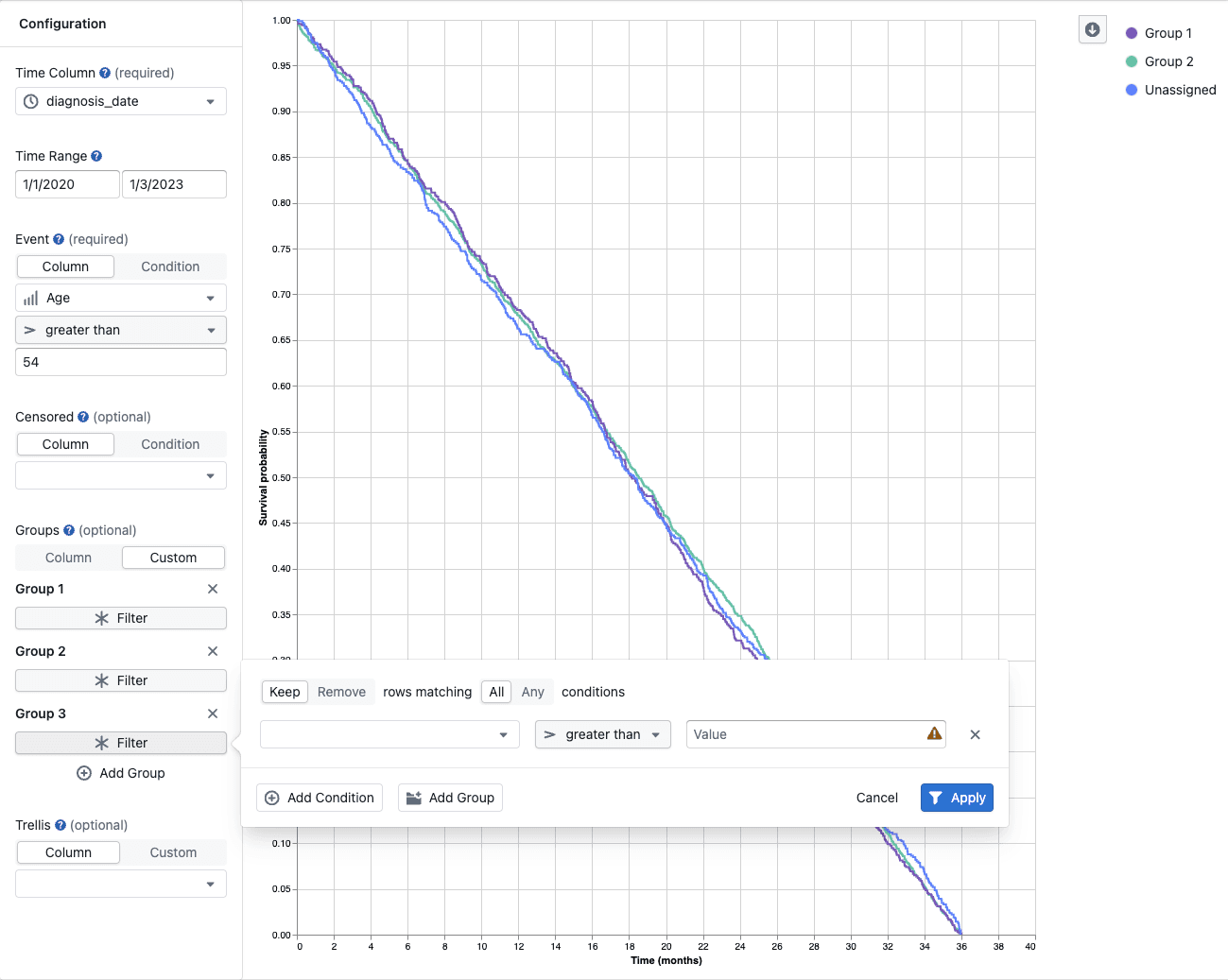
Custom — define groups manually:
- Click Add Group to create a new group entry
- Give the group a descriptive name by clicking the editable label
- Click Filter to define the filter condition that selects which rows belong to this group
- Repeat for each group you want to compare
Groups with no filter condition are ignored. If at least one group matches data, subjects not matched by any group appear as an Unassigned curve automatically.
Trellis (optional)
Split the chart into a grid of panels to compare the same groups across different subsets of data.
- Column — select a categorical or boolean column. Catalyst creates one panel per distinct value automatically.
- Custom — define bins manually:
- Click Add Bin to create a new bin entry
- Give the bin a descriptive name
- Click Filter to define the filter condition for this panel
- Add at least two bins — trellis requires two or more valid bins to activate. With only one bin, the chart displays as a single panel.
Each panel applies the same groups and event/censored logic to only the rows matching that bin.
How the Analysis Works
For each group (and each trellis bin, if configured), Catalyst calculates a standard Kaplan-Meier curve:
- The data is filtered to the selected time range, and each row is labelled as an event, censored, or excluded
- At each time point where an event occurs, Catalyst counts how many subjects were at risk and how many experienced the event
- The survival probability steps down:
survival = previous_survival × (at_risk − events) / at_risk - The curve starts at 100 % at the beginning of the selected time range
Two additional conventions to be aware of:
- Tied times — if an event and a censoring occur at the same time point, the event is counted first
- Late-tail reliability — estimates at the far right of the curve are less reliable when very few subjects remain. Check the At risk value in the tooltip, and consider narrowing the time range if the tail is based on only a handful of subjects
- Catalyst shows the Kaplan-Meier curve and basic point-by-point statistics in the tooltip, including At risk, Events, and Censored counts.
- It does not add confidence intervals, a number-at-risk table, log-rank test p-values, or hazard ratios.
- For publication-ready figures or regulatory submissions, use a dedicated statistical package such as R (
survival/survminer), SASPROC LIFETEST, or a similar tool.
If more than 5 000 observations remain after filtering, the dataset is automatically cut off. A warning appears at the top center of the screen when this happens. To work around the limit, narrow the time range or apply additional dataset filters before running the analysis.
Frequently Asked Questions
What data do I need to run survival analysis?
You need at minimum:
- A time column — numeric or date/datetime — recording when each observation was made or how long the subject was followed
- A way to identify events — a binary or flag column works best (e.g.,
event = true), or any column where a specific value marks the event. You can also build a custom multi-rule condition.
What is a censored observation?
A censored observation is one where the subject left the study before experiencing the event. This can happen because the study ended, the subject was lost to follow-up, or the subject was withdrawn for another reason. Censored subjects contribute information about survival up to the point they were last observed, but are not counted as events. They are shown as tick marks on the curve.
Catalyst supports right censoring only — meaning the event had not yet occurred when follow-up ended. This is the most common scenario in pharma and biotech studies.
Note that Kaplan-Meier analysis assumes subjects whose follow-up ended had the same future risk as those who remained in the study. If subjects left for reasons related to the event (for example, because they were getting worse and dropped out), this assumption may not hold and the curve could be misleading.
What happens to rows that match neither the event nor the censored condition?
Those rows are excluded from the analysis entirely. If you want to include all non-event rows as censored, define a censored condition that matches everything that is not an event (e.g., outcome ≠ "death").
Why is there an "Unassigned" group?
When you define one or more groups with filter conditions and at least one group matches data, Catalyst automatically creates an Unassigned group for subjects that do not match any of your defined groups. This ensures no data is silently hidden and lets you see how the unclassified subgroup behaves. You can toggle the Unassigned group off in the legend if you don't need it.
Can I compare more than two groups?
Yes. You can add as many groups as you like. Each group is shown as a separate color-coded curve. For readability, consider limiting to five or fewer groups, especially when the curves overlap.
What is the difference between Groups and Trellis?
- Groups overlay multiple survival curves in the same panel, colored differently, so you can directly compare survival within the same plot
- Trellis creates separate panels (a grid), with each panel showing the same groups but restricted to a different subset of the data — useful when you want to see how an effect varies across a third variable without curves overlapping
My dataset was truncated. What should I do?
Survival analysis is limited to 5 000 rows for performance reasons. Try:
- Narrowing the time range to a shorter window
- Applying global filters in the study view to reduce the dataset size before opening the survival analysis
Why does the curve start above 0 % survival at the first time point?
The curve is set to 100 % survival at the start of the selected time range (the lower bound you configured). It only steps down when events occur. If there are no events in your data, the curve will remain flat at 100 %.
What time column types are supported?
Numeric columns (integer and float) and date/datetime columns are supported. The x-axis unit is inferred automatically for date/datetime columns — days, months, or years — based on the length of the selected time range. String and duration columns cannot be used as the time column.