PCA Explained Variance
Access Athinia Catalyst at catalyst.athinia.io.
This tab shows how variance is distributed across components and lets you inspect feature contributions (loadings) for any component.
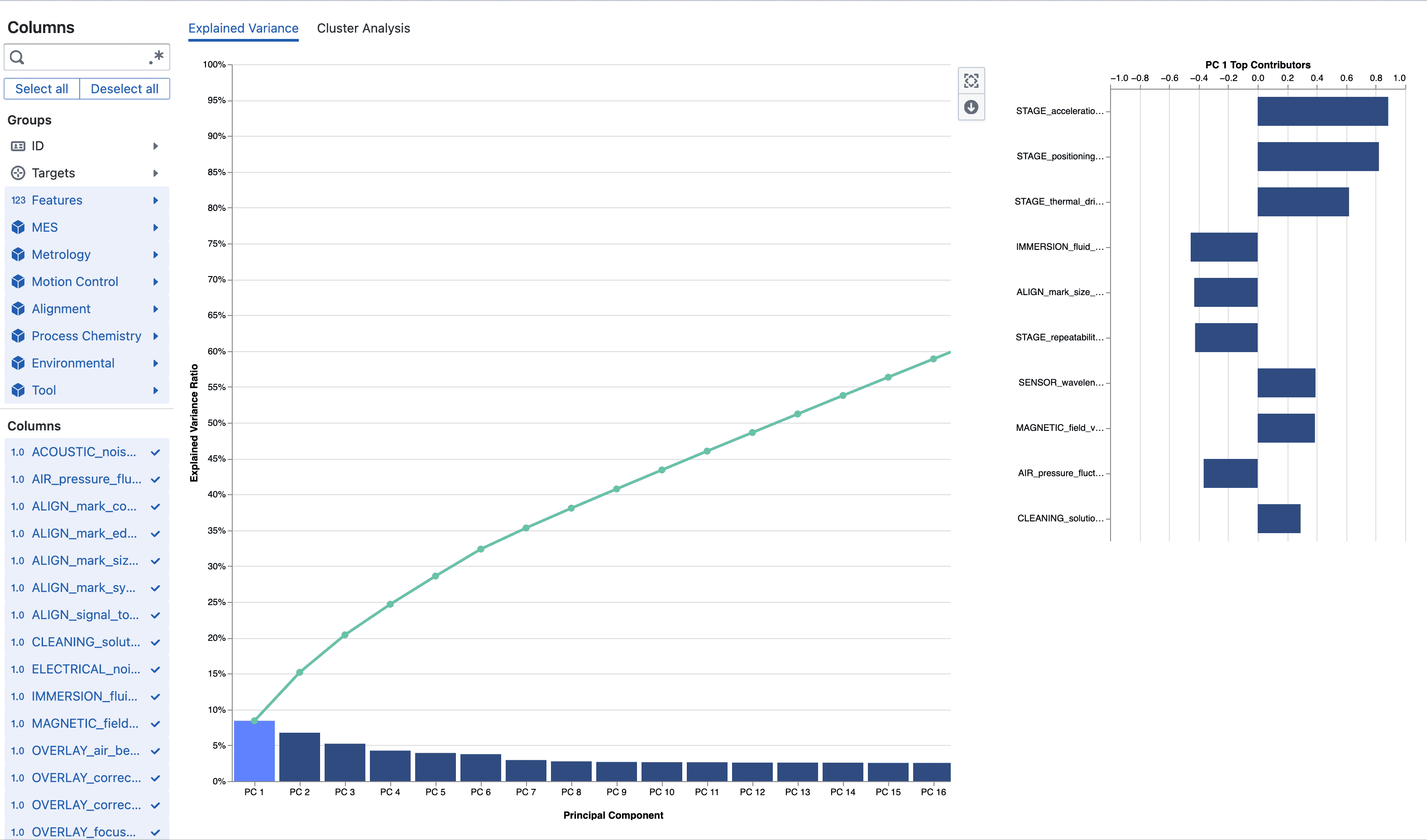
You see a bar chart of individual explained variance ratios (one bar per PC in order) with a green cumulative line overlaid so elbows or plateaus are easy to spot. Only components required to reach the configured variance threshold (currently up to 100%) are rendered. Clicking a bar selects that component and populates the adjacent Feature Contribution panel.
The Feature Contribution (loadings) chart displays horizontal bars centered around zero. Positive and negative directions indicate inverse relationships between features along that latent axis. Large absolute magnitude points to strong influence. Assign internal mnemonic labels (e.g. “Metallization Uniformity”, “Thermal Drift”, “Etch Balance”) to assist communication.
Tool icons above or beside charts provide:
- Zoom to fit: Condenses component layout (switches from stepped bars to compact width) for large component counts.
- Download plot: Exports the current visualization (for reports or slide decks).
Interpreting results typically proceeds by scanning the cumulative curve to pick a retention cutoff, clicking early PCs to inspect loadings, recording provisional semantic labels, and deciding which PCs to monitor downstream.
Cluster Analysis
This tab enables interactive segmentation on the first two PC score axes (PC1 vs. PC2). Points start unassigned (cluster name “Unassigned”).
You create a rectangular brush by clicking and dragging within the scatter. Releasing finalizes the selection. Right‑click opens the Cluster Manager at the cursor location, tied to the current brush. Double‑click inside the plot (or single-click without holding Shift after a selection) clears the live brush; the module also overlays a persistent dashed rectangle for the last explicit brush to make selection boundaries visible.
Available cluster operations in the context menu:
- Create cluster: Assign the currently brushed points to a new named cluster.
- Add to cluster: Append brushed points to an existing cluster.
- Remove from clusters: Unassign brushed points (back to Unassigned).
- Rename cluster: Update naming to reflect process meaning (e.g. “Edge Heating”).
- Delete cluster: Remove a cluster and its associations.
- Reset all: Clear every cluster, brush history, and comparison selection.
- Clear brush: Remove just the active selection rectangle.
Clusters persist locally per study (stored in browser localStorage under a study-specific key) together with brush history and any chosen comparison pair. Returning to the same study with the same feature selection reloads them. Changing the selected feature set invalidates prior score coordinates and resets clusters.
Sigma ellipses (1σ, 2σ, 3σ) may appear as faint dashed contours when ellipse parameters are supplied, approximating multivariate dispersion for quick outlier distance assessment.
Cluster Comparison
Once you have at least two non-empty clusters the right-side panel lets you select Cluster A and Cluster B. Press Analyze differences to compute adjusted contribution scores ranking how strongly each feature differentiates those clusters in latent space. While this analysis runs, the scatter temporarily desaturates (grayscale overlay). The resulting bar plot lists features ordered by discriminant strength (higher absolute score = stronger separation). Use this to prioritize metrics for root cause investigation or monitoring thresholds.
Interaction Summary (Key Actions)
- Drag to brush a region of points.
- Right‑click to manage clusters.
- Double-click (or non-shift single click on plot) to clear the active interactive brush.
- Rename clusters to reflect process or tool states before exporting insights.
- Re-run Analyze differences after refining cluster boundaries.
- Download visuals as needed for reports.
Interpreting Outputs
A dominant PC1 (large bar) signals a broad shared variation driver suitable for high-level monitoring (e.g. thermal or deposition uniformity). An early cumulative plateau shows heavy redundancy—dimensionality can be reduced without losing significant information. High-magnitude loadings identify critical contributors for SPC charts. Well-separated clusters on PC axes indicate latent operational modes or recipe regimes. Top difference features highlight candidate levers or failure signatures (e.g. via resistance, overlay X, chamber pressure stability index).
Example Flow
You select 150 inline and electrical parameters. The Explained Variance plot shows PC1–PC7 reach 92% cumulative variance; early loadings reveal PC2 dominated by via chain resistance and copper thickness inversion, so you label it “Metallization Uniformity”. In Cluster Analysis, two natural bands appear separated along PC2; you brush each, create clusters “Normal” and “High Resistance Drift”, then run Analyze differences. The difference plot elevates resistance and thickness metrics, confirming a plating drift hypothesis. You export the plots and flag the cluster metrics for targeted process checks.
Frequently Asked Questions
What is PCA used for?
PCA reduces the dimensionality of your data while preserving as much variance as possible. It's useful for data visualization, feature reduction, and understanding the underlying structure of complex datasets.
How many components should I use?
Generally, choose enough components to capture 80-95% of the total variance. The exact number depends on your specific use case and how much information loss you can tolerate.
What do the feature contributions mean?
Feature contributions show how strongly each original feature influences a principal component. Positive (blue) contributions increase the component value, while negative (red) contributions decrease it.
Can I use PCA with categorical data?
PCA works best with numerical data. Categorical variables should be encoded numerically (e.g., one-hot encoding) before analysis, though this may not always be meaningful.