Plots
Access the Athinia analytics platform at catalyst.athinia.io.
Gallery
Overview
The Plot Builder is a powerful data visualization tool that helps you explore relationships between variables in your dataset. With its intuitive drag-and-drop interface, you can quickly create insightful visualizations without writing any code.
Creating Plots
To create a visualization:
- Select columns from the left sidebar by dragging them to the appropriate drop zones:
- Drag a column to the X-axis drop zone (bottom)
- Drag a column to the Y-axis drop zone (left side)
- Optionally, drag a categorical column to the Color drop zone (right panel)
Plot Types
The Plot Builder automatically selects the most appropriate visualization based on your data types:
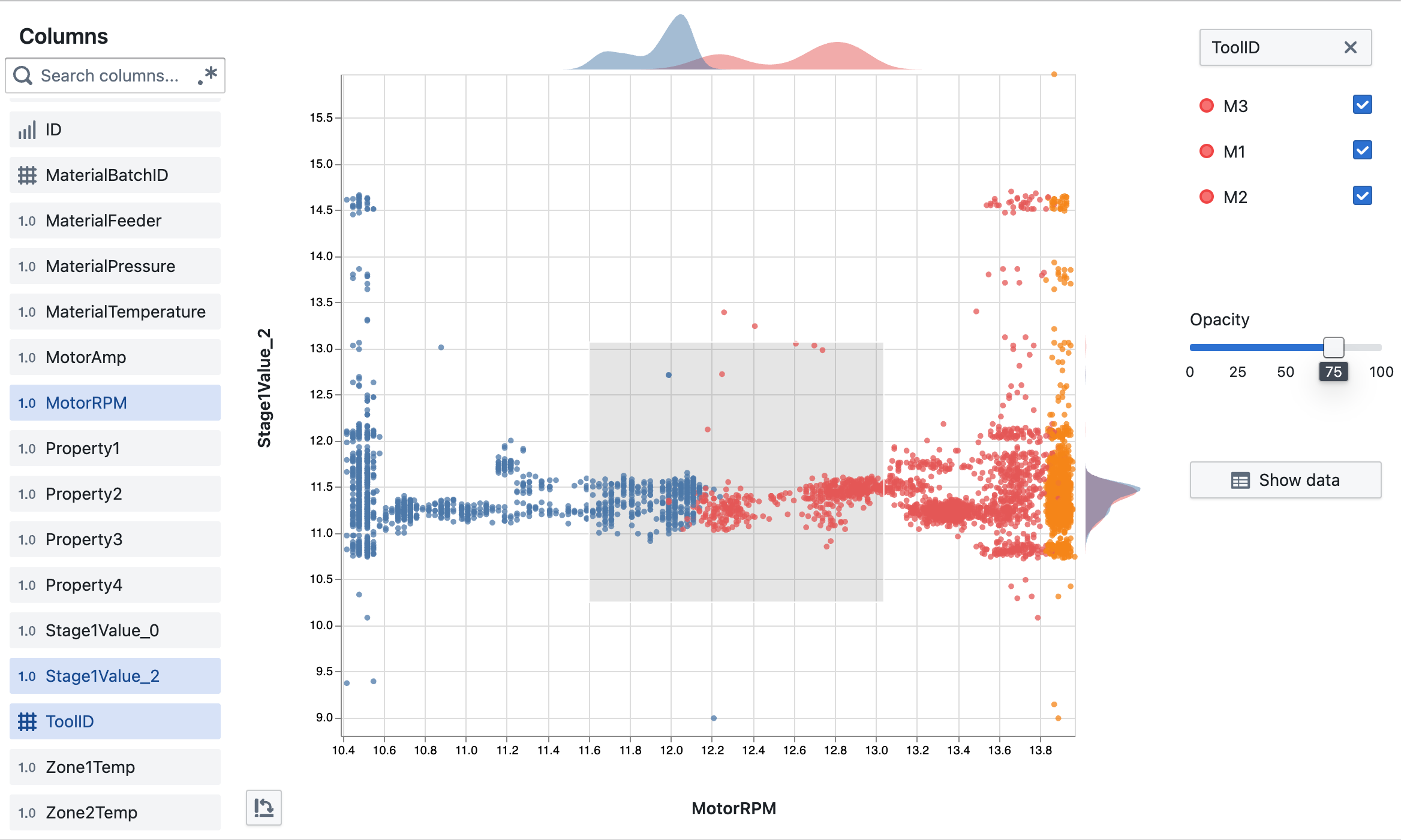
- Scatter Plot: When both axes use numerical data (e.g., MotorRPM vs. Stage1Value_2)
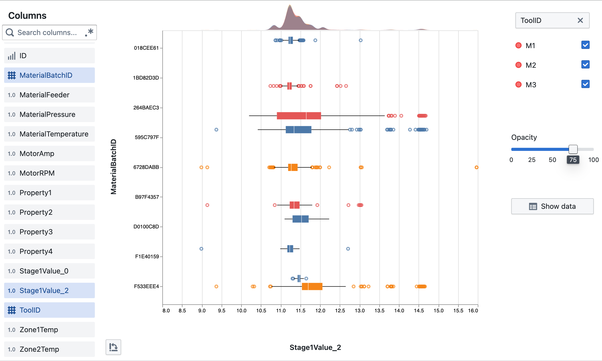
- Box Plot: When one axis is categorical and one is numerical (e.g., ToolID vs. Stage1Value_2)
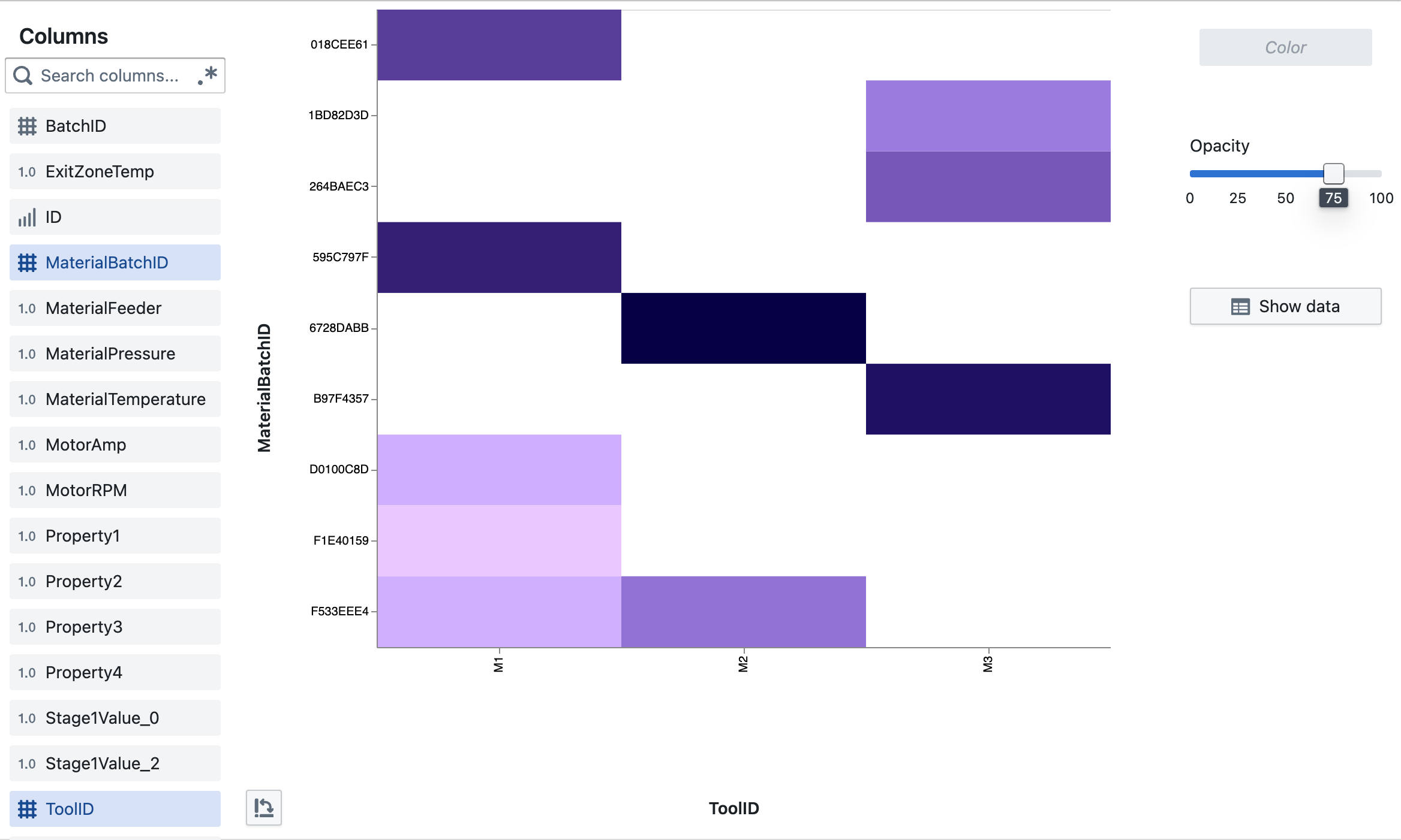
- Heat Map: When both axes use categorical data (e.g., ToolID vs. MaterialBatchID)
Interactive Features
- Zoom: Select a region by clicking and dragging to zoom into specific data areas
- Flip Axes: Use the rotate button to swap X and Y axes
- Adjust Opacity: Use the slider to control point transparency (helpful for dense data)
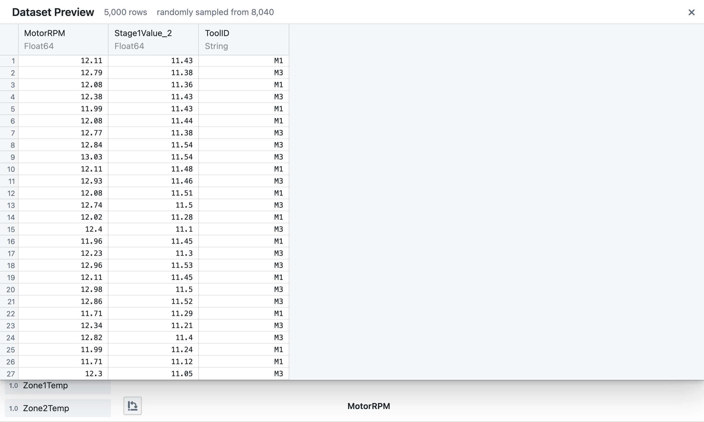
- Show Data: Click "Show data" to display the underlying dataset in a table view
- Data Filtering: The zoomed area automatically filters the data shown in the table view
Working with Colors
Color-code your data points by a categorical variable:
- Drag a categorical column (like ToolID or MaterialBatchID) to the Color drop zone
- Points will be colored according to their category values
- The legend will appear showing which color corresponds to each value
- Remove a color variable by clicking the × icon
Tips for Effective Visualization
- Use color to highlight patterns across different categories
- Adjust opacity when visualizing dense datasets to reveal overlapping patterns
- Use the box plot view to identify outliers and distribution differences between groups
- Flip axes to change perspective when analyzing relationships
The Plot Builder is designed to help you explore your data dynamically and discover meaningful insights through visual analysis.
Frequently Asked Questions
How do I create a plot?
Drag columns from the left sidebar to the appropriate drop zones. Place one column on the X-axis (bottom) and another on the Y-axis (left side). The Plot Builder automatically selects the most suitable visualization type.
What types of plots can I create?
The Plot Builder automatically selects from:
- Scatter Plot: When both axes use numerical data
- Box Plot: When mixing categorical and numerical data
- Heat Map: When both axes use categorical data
How do I change which columns are being plotted?
Drag new columns from the sidebar to the X or Y axis drop zones. The current selection will be replaced with your new choice.
How do I flip the X and Y axes?
Click the flip button (rotate icon) located at the bottom left of the plot area.
How can I adjust point opacity?
Use the Opacity slider on the right panel. This is especially useful when you have overlapping data points.
How do I color-code my data points?
Drag a categorical column to the "Color" drop zone in the right panel. Each category will be assigned a unique color.
How do I remove the color grouping?
Click the "×" icon next to the column name in the Color drop zone.
How can I see the raw data behind my plot?
Click the "Show data" button in the right panel to view the tabular data.
Can I filter the data shown in the plot?
Yes, you can:
- Click and drag to select an area on the plot
- Click "Show data" to view only the points within that selection
Is there a limit to how much data I can visualize?
For performance reasons, the Plot Builder samples up to 5,000 rows from your dataset. If your dataset is larger, the data table will indicate that the view is sampled.
Will my plot configuration be saved?
Yes, the plot configuration is saved in the URL, allowing you to share or bookmark specific visualizations.
Why is my plot appearing in grayscale?
The plot appears grayscale when data is being fetched. Once loading is complete, full colors will appear.
What happens if I select an inappropriate column type?
The Plot Builder will automatically select the most appropriate visualization type based on your column selections, so you don't need to worry about choosing incompatible column types.
Can I export my plots?
While there isn't a direct export button, you can use your browser's screenshot functionality or a screen capture tool to save your visualizations.